A focused homepage redesign for a Beauty shop, improving brand clarity, product discovery, and category browsing for first-time visitors.
Osaka Ebisu offers curated J-Beauty and K-Beauty products, but the first screen of the homepage did not make that clear. The hero image felt visually disconnected from the product offering, and visitors were taken directly into a product grid without enough context about the store.
Make it clear within seconds that Osaka Ebisu offers curated J-Beauty and K-Beauty products.
Use featured products to guide newcomers who may not know where to begin.
Use visual category entry points to help visitors quickly explore relevant product groups.
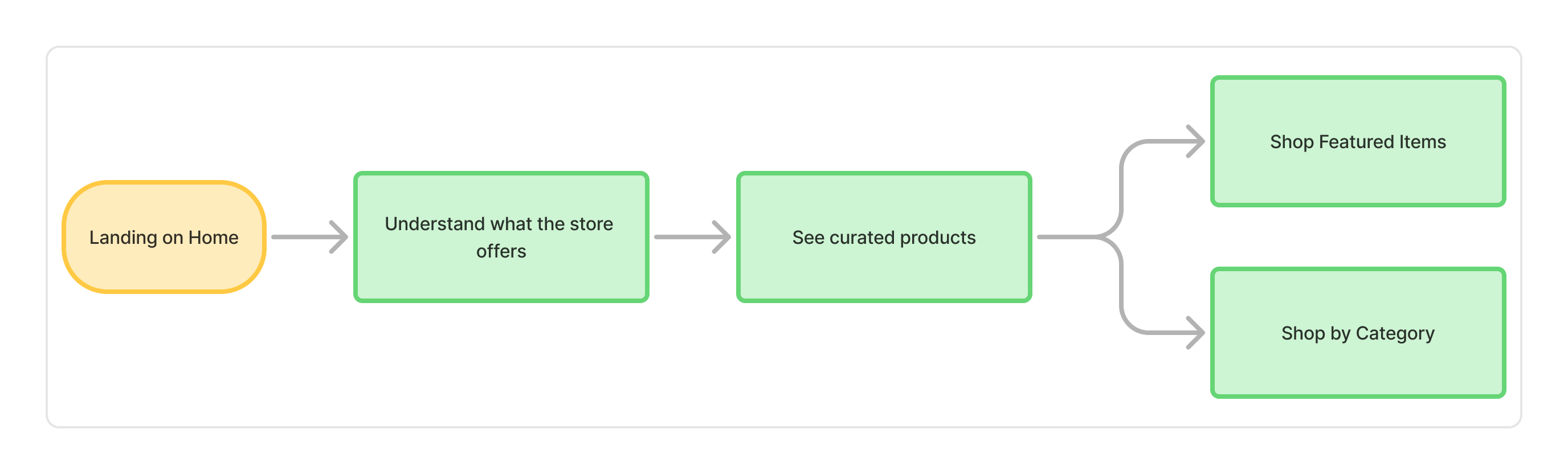
Task Flow
I mapped the primary path a first-time visitor would take: landing, understanding what the store offers, seeing curated products, then choosing where to go next.
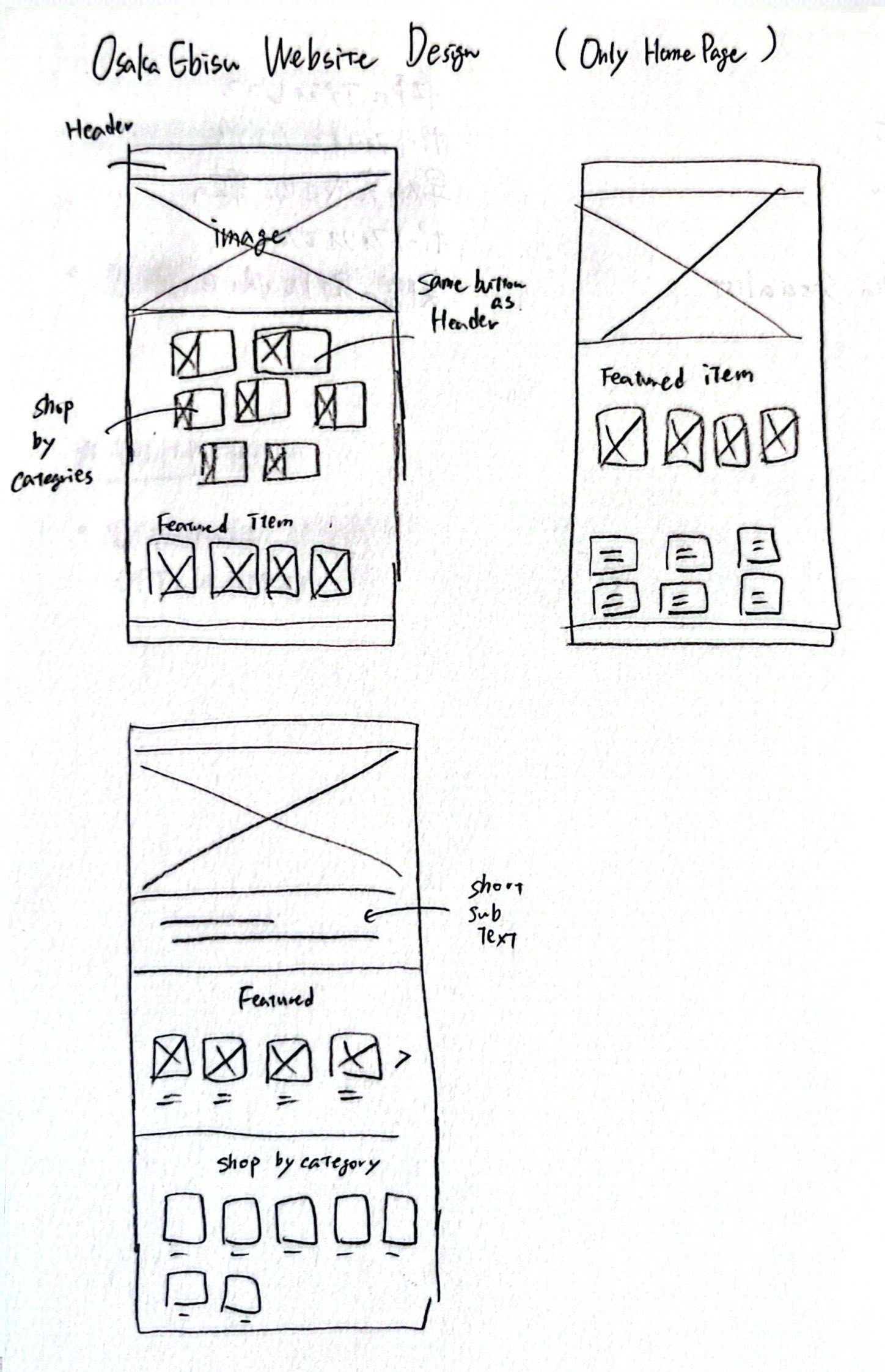
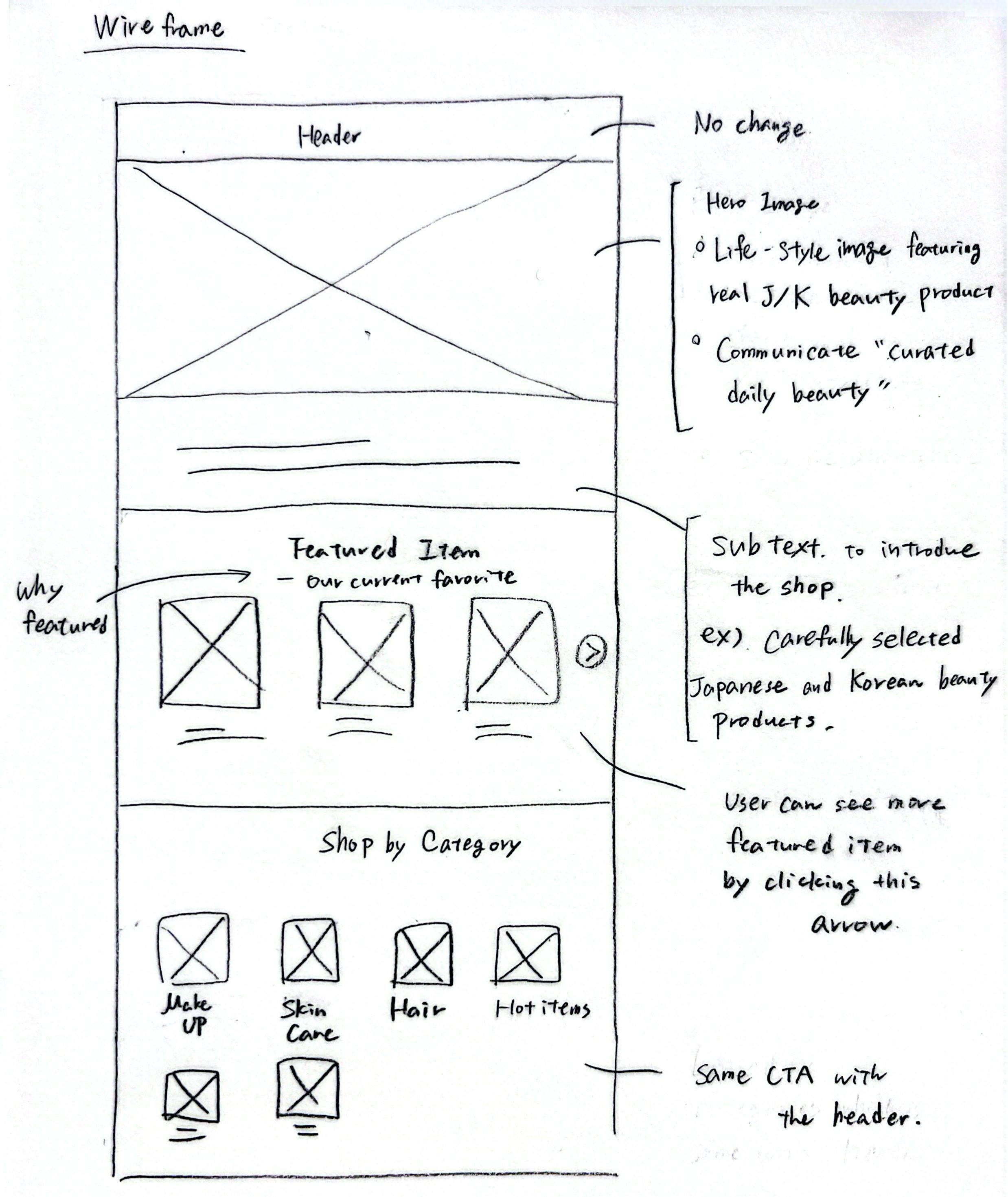
Sketches
Wireframe
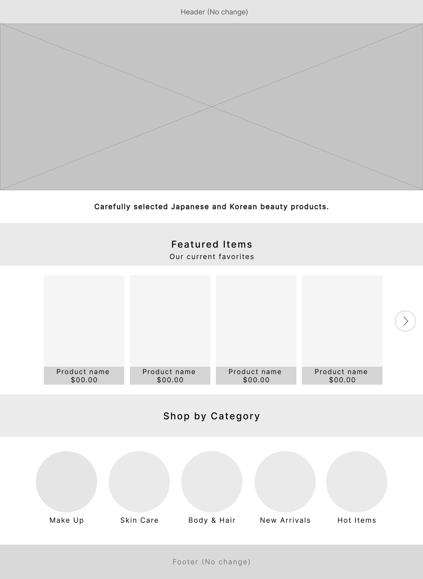
Low-Fidelity Prototype
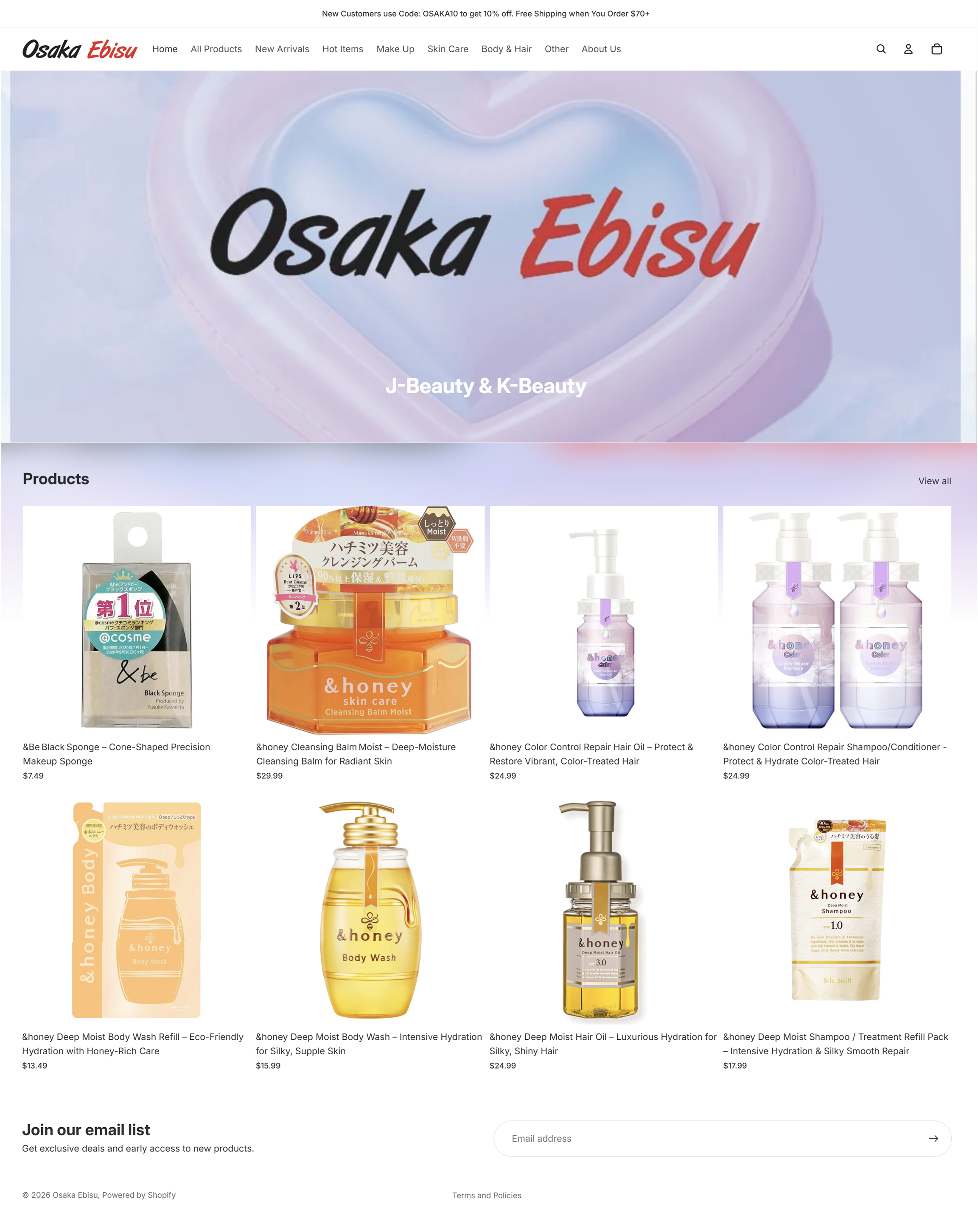
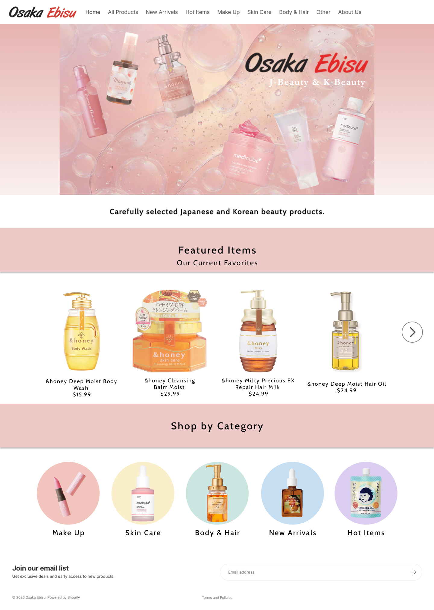
The hero area was planned to communicate the shop’s J-Beauty and K-Beauty identity at a glance.
Featured products give first-time visitors a clear starting point before browsing the full catalog.
Visual category tiles help visitors quickly move toward the type of product they are looking for.
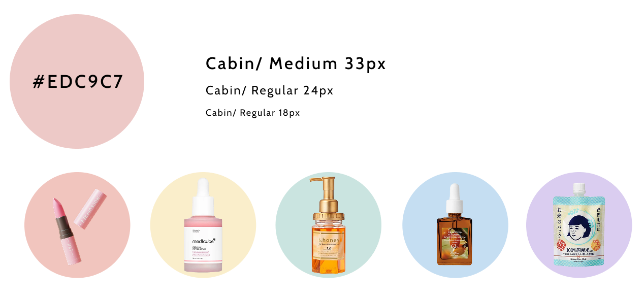
Visual Direction
I defined a soft visual direction using a warm pink palette, clean typography, and rounded category visuals.
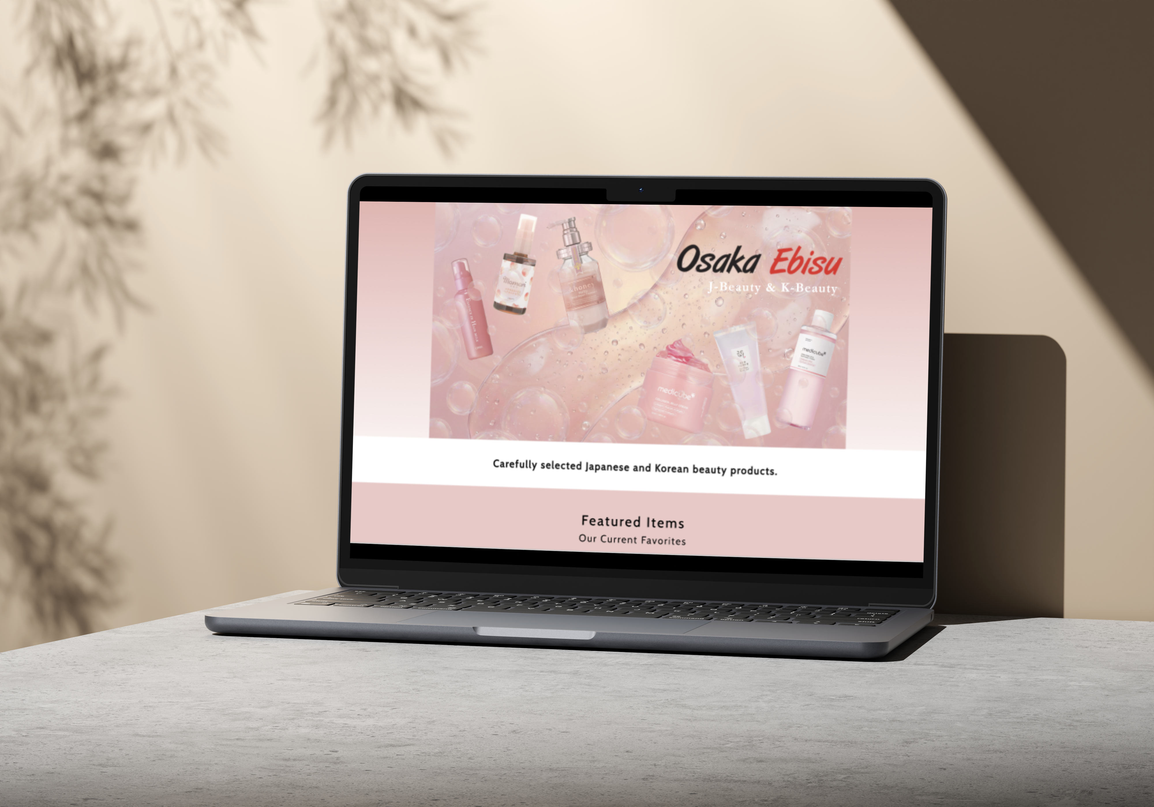
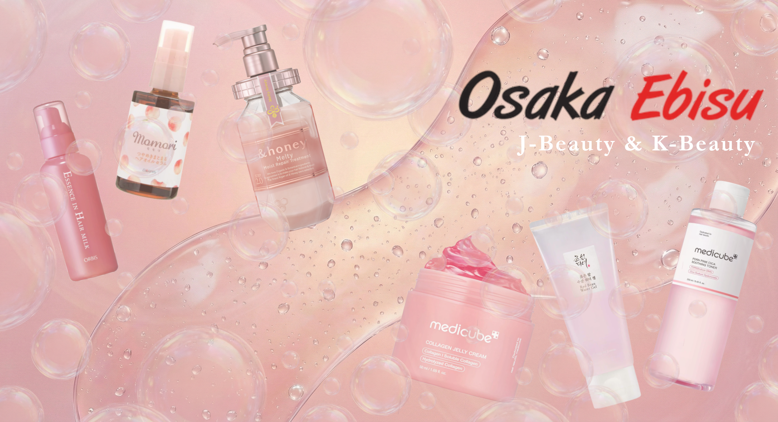
The original homepage used an abstract branded graphic that did not show the product category. To make the store’s identity clearer, I created a new hero image in Photoshop using actual Osaka Ebisu products
Sketches
I started with thumbnail sketches to explore product placement and composition before moving into Photoshop.
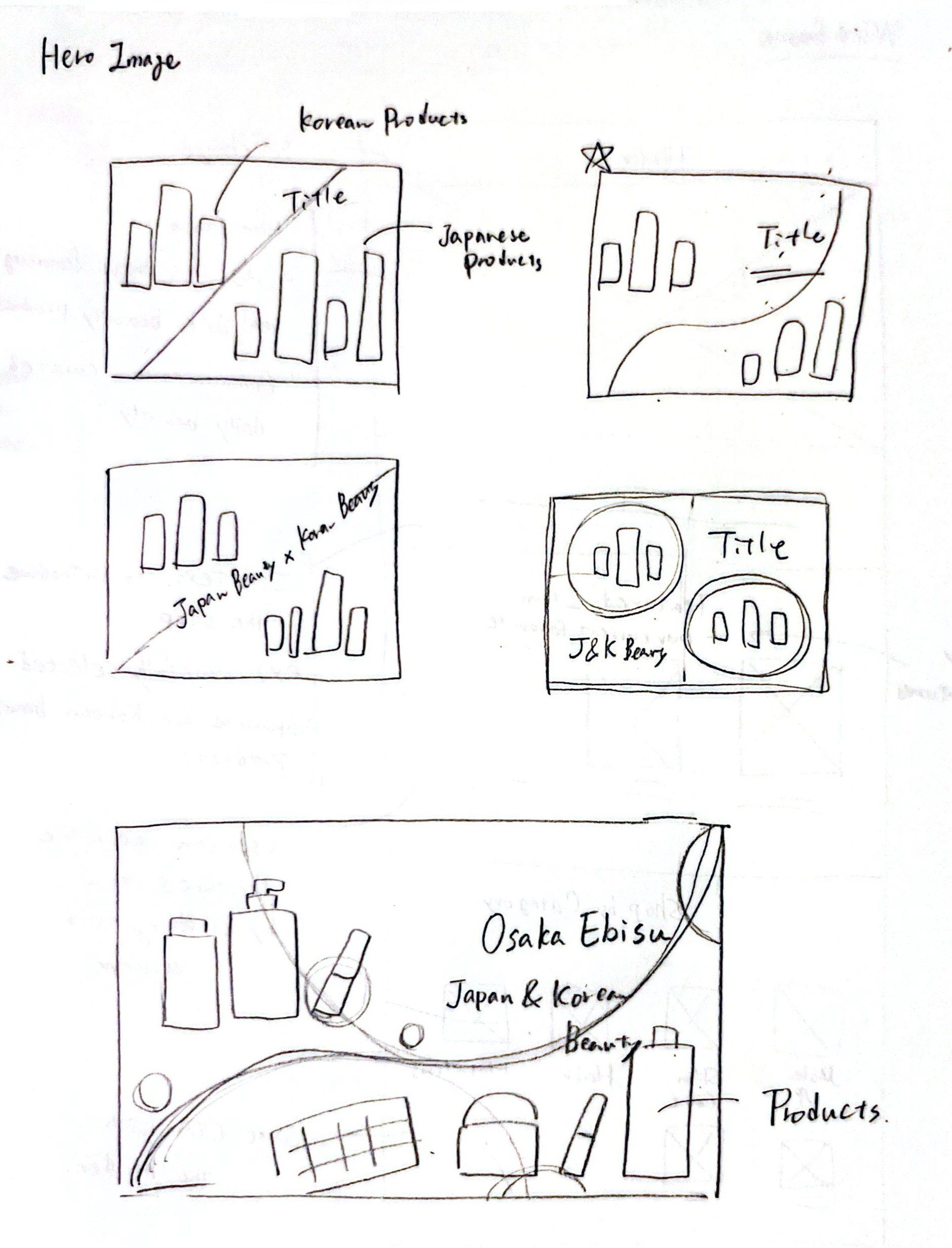
Final Hero Image
The final image combines product cutouts, soft textures, and layered visual elements to communicate the shop’s identity at a glance.
The original screen had the right ingredients, but they were not structured in a way that helped new visitors understand the store. I learned that clarity does not come from adding more information. It comes from deciding what users need to understand first.
The hero image, featured products, and category tiles were not just styling choices. They helped communicate identity, reduce uncertainty, and guide visitors toward exploration. I learned to use visual design as part of the user flow, not just decoration.