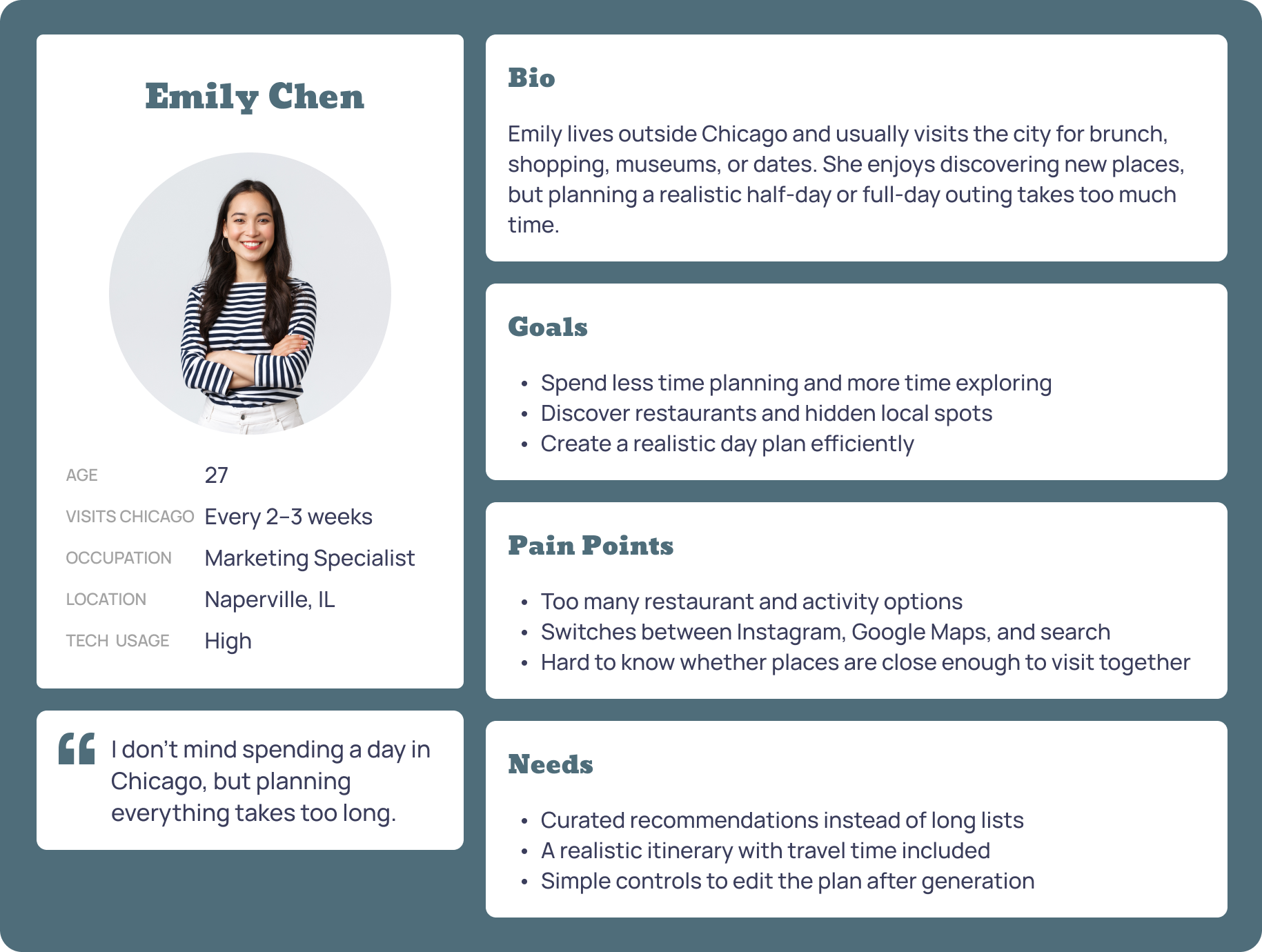
Emily Chen
Suburban Weekend Explorer
Represents users who visit Chicago for half-day or full-day outings and need help turning scattered ideas into a realistic plan.
An AI-powered mobile app that generates personalized local exploration plans for Chicago, designed to reduce planning friction while keeping users in control.
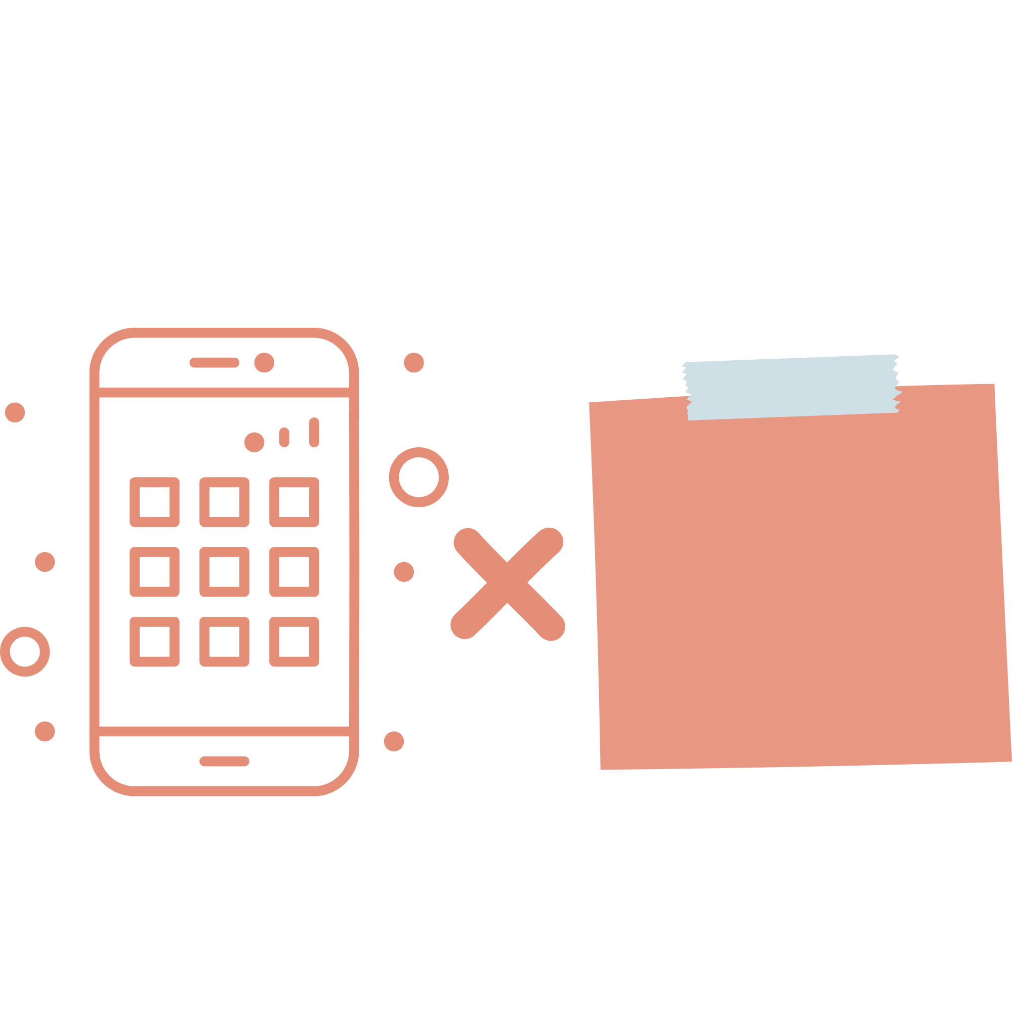
Chicago has a wide variety of unique restaurants, shops, events, and cultural experiences. But planning a local outing still takes a lot of time because users have to search across multiple apps, compare options, check distance, and manually organize everything into one plan. This becomes especially frustrating for people who want to discover local spots instead of tourist-heavy places.
Design an AI-powered planning experience that helps users quickly create and customize a personalized itinerary for exploring Chicago’s local spots.
- My Design Process -

Background Research
I started with background research to understand broader patterns in travel planning, local discovery, and AI itinerary tools. I reviewed articles, UX case studies, and online travel resources to understand where existing planning experiences fall short.

Many tools provide long lists of places, but users still have to compare options, check details, and decide what fits into one outing.
Tourist-heavy recommendations are easy to find, while hidden gems often depend on local knowledge, events, niche searches, and community-based sources.
AI planning can reduce effort, but users need to understand why places were recommended and be able to edit the plan easily.
Users relied on Google Maps, Instagram, and Google Search. But the process became time-consuming because they still had to compare options, check hours & distance, and manually organize everything into a plan.
Participants wanted to discover local places, not the same famous tourist spots they already knew.
Users were open to AI-generated plans, but trust depended on whether the recommendations felt realistic, transparent, and easy to customize.
User Interviews
After background research, I interviewed four Chicago-area users who regularly visit the city. I wanted to understand how they discover places, plan local outings, and feel about AI-generated plans.
Competitive Analysis
I analyzed 12 direct and indirect competitors to understand how existing tools support discovery, itinerary planning, local recommendations, AI-generated plans, and user control.
Mindtrip · TripAdvisor AI · Wanderlog
These tools can generate or organize itineraries with maps, saved places, and day-by-day planning. However, they are mainly built for tourists, multi-day trips, or detailed manual planning.
Google Maps · Yelp
These tools are strong for checking ratings, reviews, hours, distance, and location credibility. However, users still have to compare options, decide the order, and build the plan themselves.
Eventbrite · Meetup · Facebook · Nextdoor
These platforms help users find local events, community activities, and neighborhood recommendations. However, events are usually treated as separate items, not part of a complete outing plan.
Instagram · Spotted by Locals · Choose Chicago
These tools help users find inspiration, local recommendations, or Chicago-specific content. However, none of them help users turn discovered places into an editable itinerary.
Direct competitors have strong itinerary features, but they are mainly designed for multi-day tourist planning, not short local exploration.
Indirect competitors can help users find ideas, but they do not help users turn those places into a realistic itinerary.
Some tools require too much manual work, while others simplify planning but provide shallow personalization or limited editing.
Existing tools either support itinerary planning, local discovery, or user control, but none combine all three for short, local exploration.

To move from research into design, I synthesized the findings in two steps: user needs analysis and design opportunities.
User Needs Analysis - 7 Themes
I used affinity mapping to organize findings from user interviews and background research. Through this process, I grouped related notes into seven recurring user needs themes. These themes clarified what the product needed to support before moving into design.
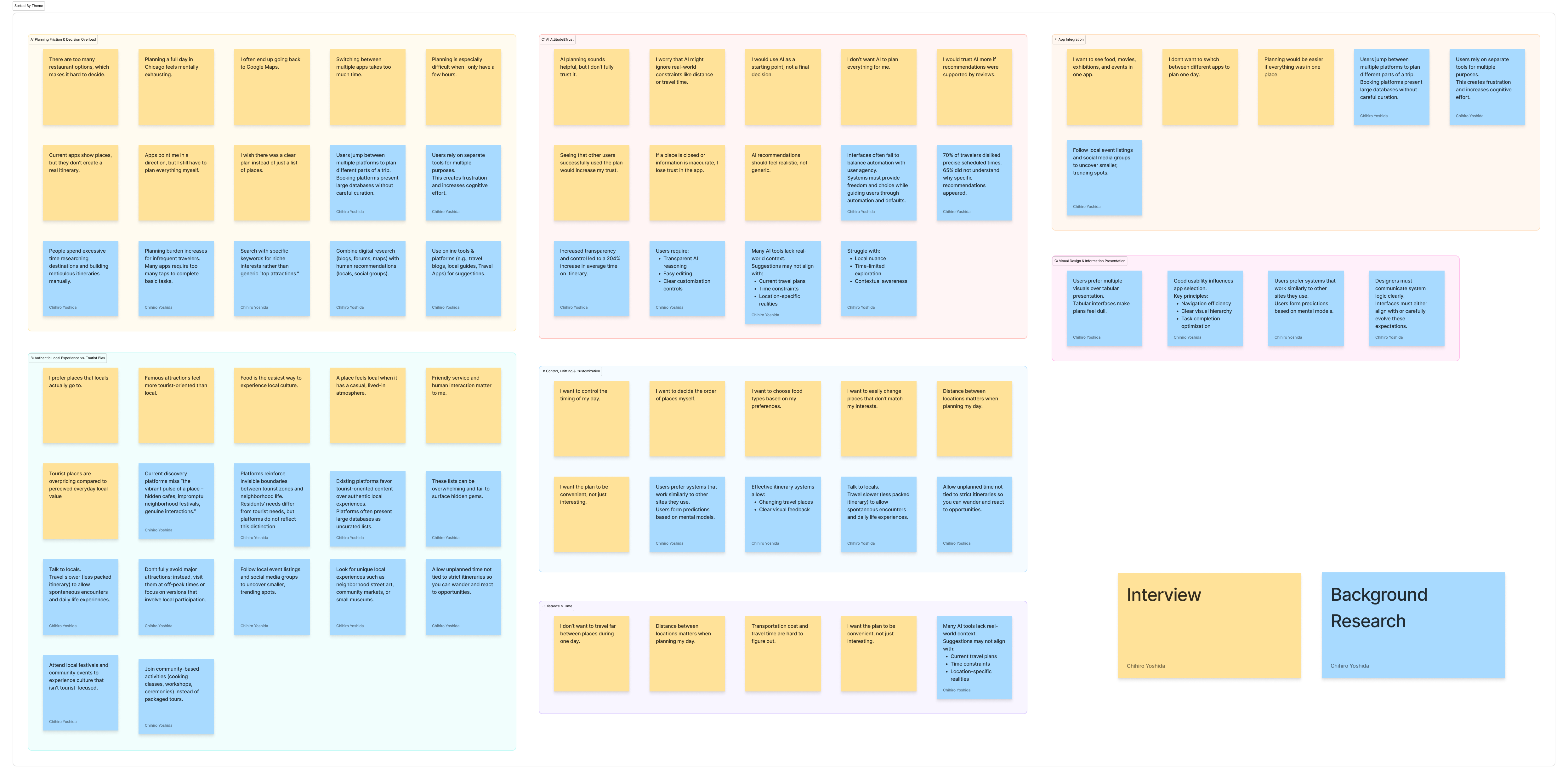
Users needed a faster way to turn scattered options into a complete plan without manually searching, comparing, and organizing everything.
Users wanted recommendations that felt local, not just famous tourist attractions or generic popular places.
Users were open to AI-generated plans, but needed clear reasoning, accurate information, and transparency before trusting the recommendations.
Users wanted AI to create a starting point, but they needed simple ways to swap, reorder, and adjust the plan without starting over.
Users needed the plan to feel realistic, with locations arranged efficiently and travel time clearly shown between stops.
Users wanted food, events, activities, rates, and planning to feel connected in one flow instead of switching between multiple apps.
Users needed visual, easy-to-scan information such as cards, photos, and maps instead of text-heavy lists or dull tables.

Design Opportunities
I then compared the seven user needs themes with the competitive analysis findings to define design opportunities. This step helped me decide which problems were most important to address in the prototype.
Generate a complete 2–4 stop plan from time, location, and interests.
Use both general interests and situational inputs to create more relevant plans.
Show a short reason for each stop to make AI recommendations easier to trust.
Let users swap, reorder, remove, and adjust stops without restarting the plan.
Show travel time between stops and keep the itinerary realistic.
Use cards, photos, maps, and clear feedback instead of text-heavy lists.

After synthesizing the research findings, I defined the product experience through personas, journey maps, core use cases, and task flows. This helped translate user needs into concrete design directions.
Personas
The target users are people who want to explore Chicago beyond tourist attractions, but do not want to spend too much time searching, comparing, and organizing plans across multiple apps.
Suburban Weekend Explorer
Represents users who visit Chicago for half-day or full-day outings and need help turning scattered ideas into a realistic plan.
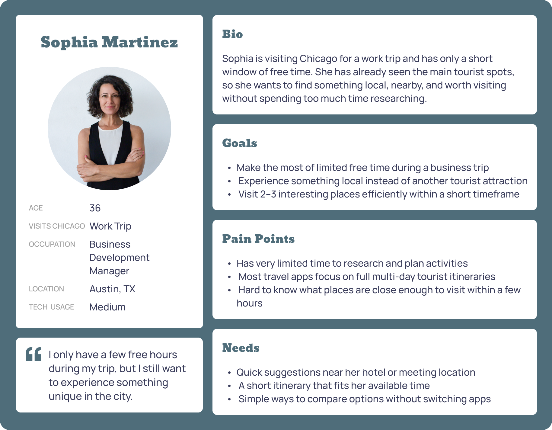
Time-Limited Business Traveler
Represents users with only a few free hours who need quick, nearby, non-touristy suggestions that fit a strict time window.
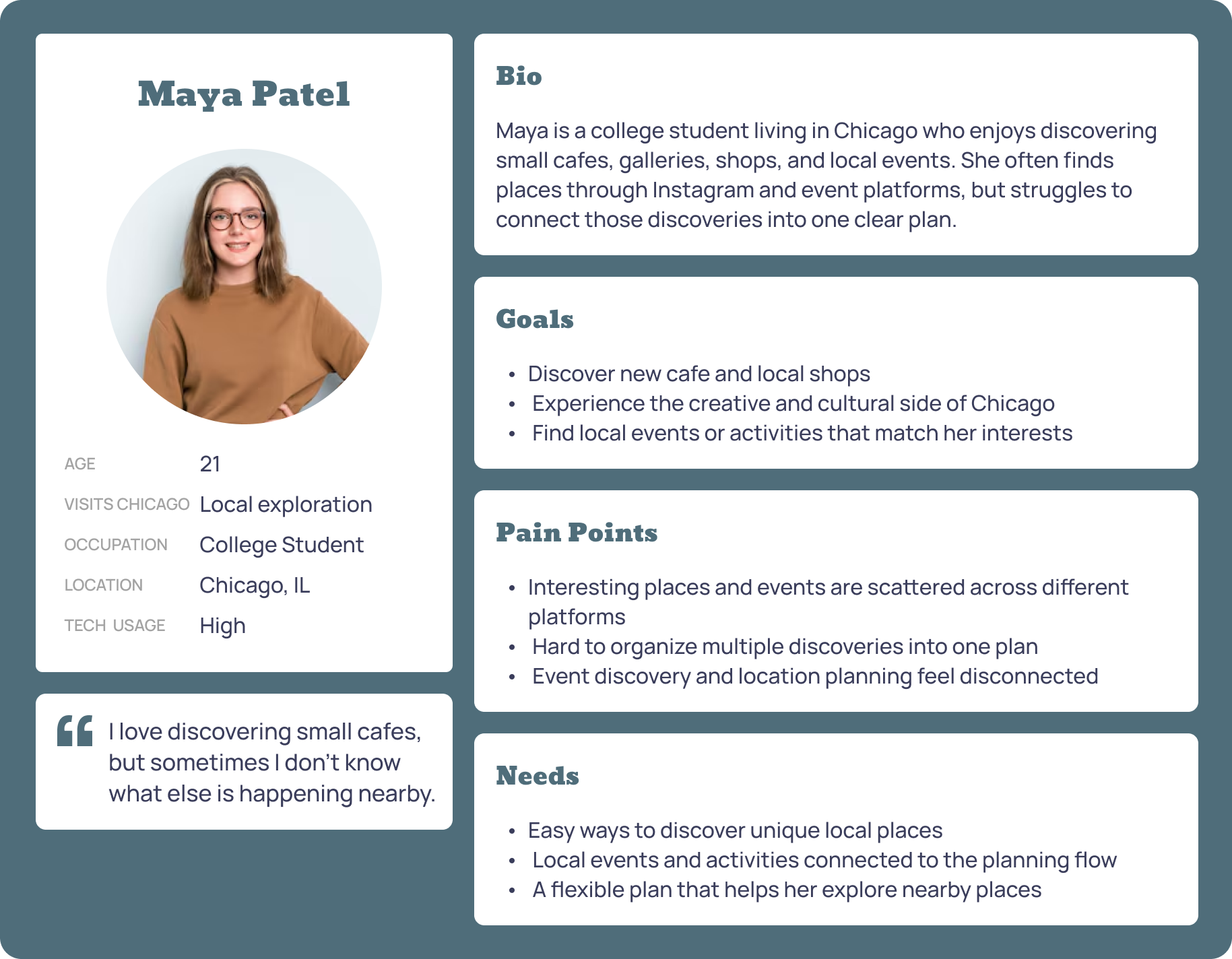
Curious Local Explorer
Represents local users who discover cafes, galleries, and events through social/event platforms but struggle to connect discoveries into one plan.
Journey Maps
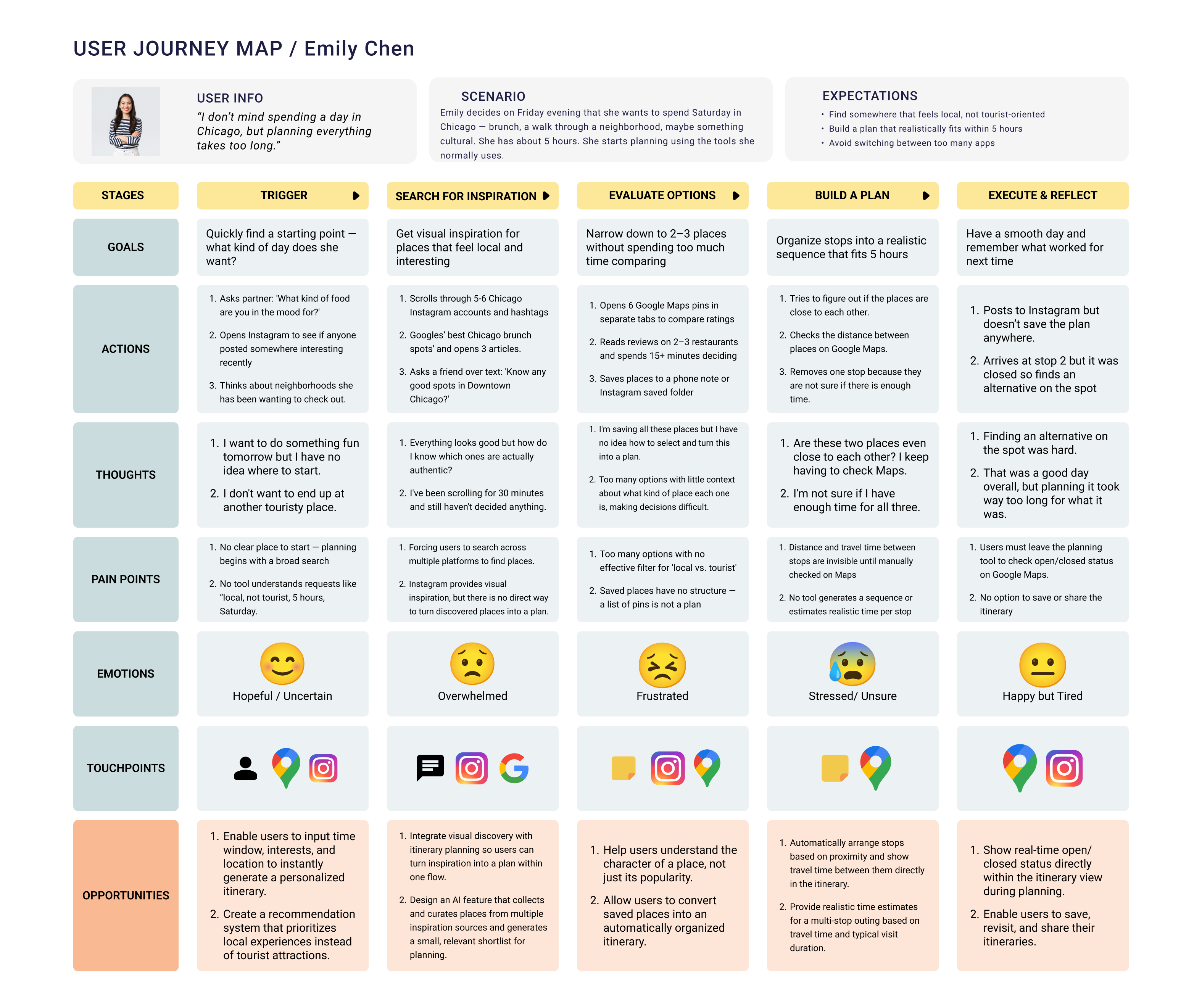
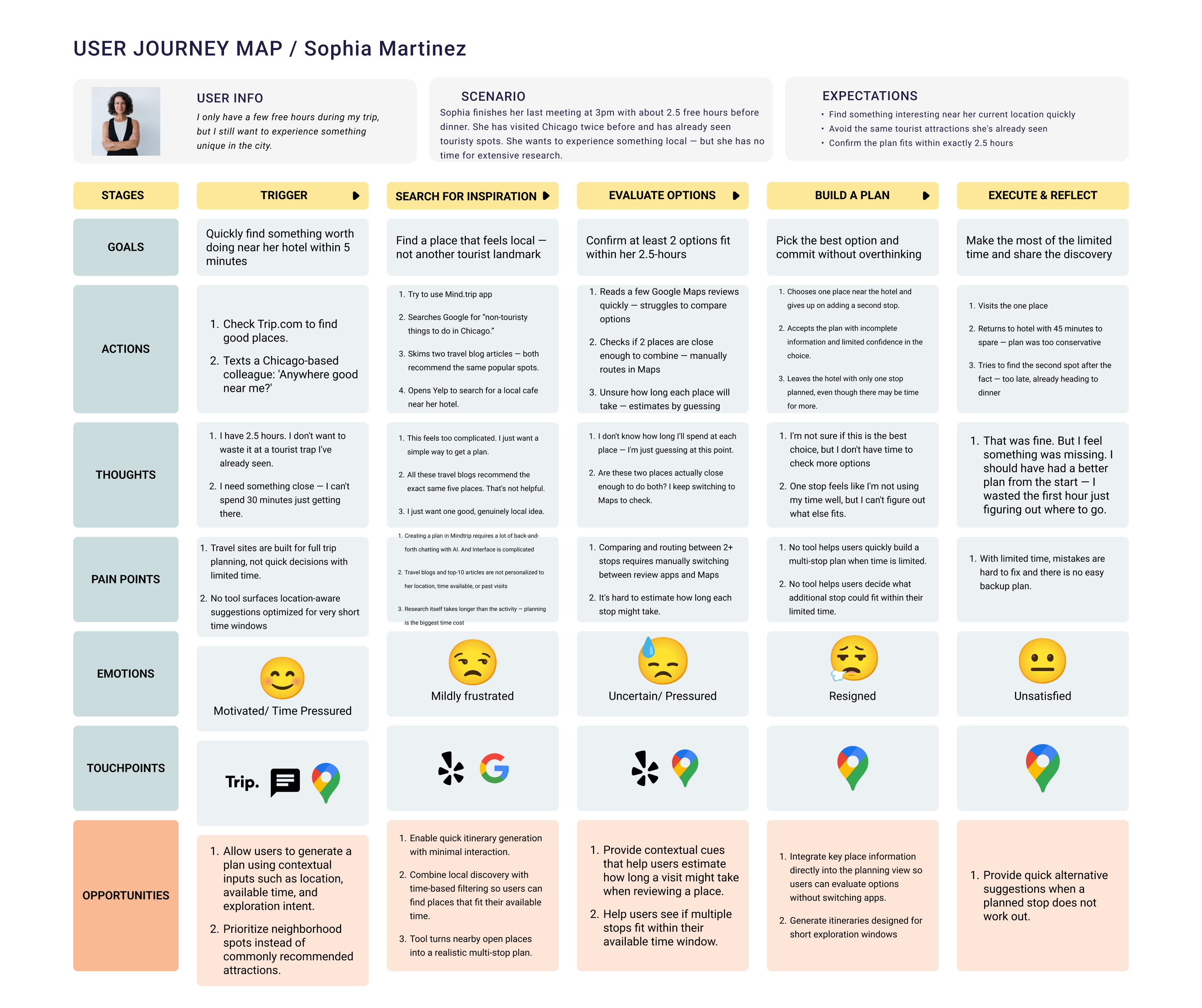
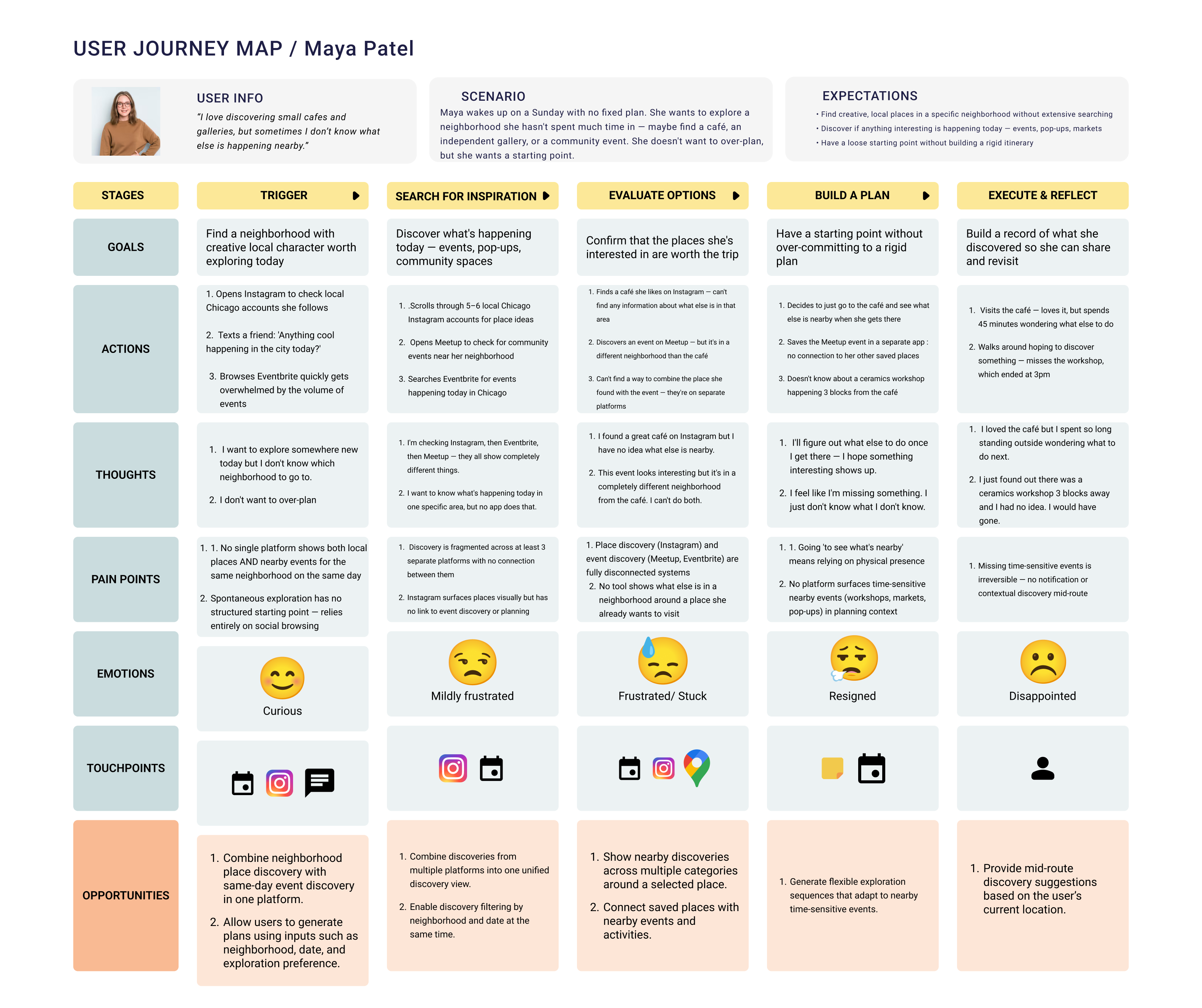
I created current-state journey maps to understand how different users discover places, compare options, and build plans. Across Emily, Sophia, and Maya, the same pattern appeared: users started with motivation, moved through several disconnected tools, became overwhelmed while comparing options, and ended with a plan that felt incomplete or inefficient. This reinforced the need for one flow that connects discovery, itinerary generation, travel-time awareness, and easy editing.
The first core use case focused on helping users create a realistic local exploration plan within a few minutes. The user enters available time, location, and interests, then receives a 2–4 stop itinerary that fits their context. This use case directly addressed the research finding that users wanted to reduce manual searching, comparison, and planning across multiple platforms.
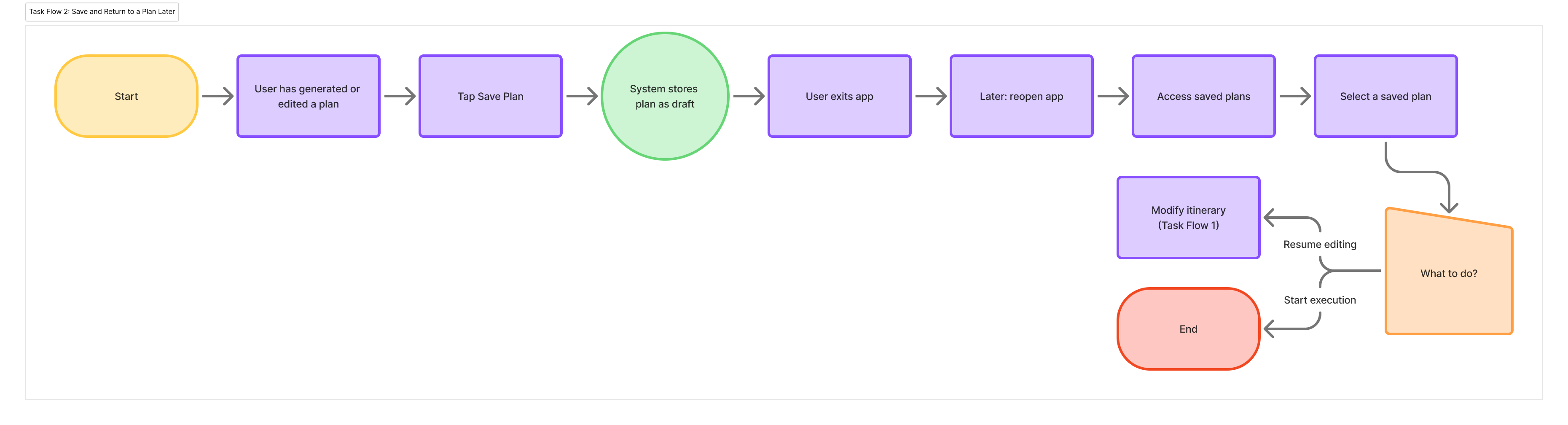
The second use case focused on flexibility. Users may generate or edit a plan before they are ready to use it, so the experience needed to support saving, returning, and continuing later without rebuilding the itinerary.
Core Use Cases
The prototype includes several supporting features, but I defined two core use cases to keep the product experience focused.
Task Flows
After defining the core use cases, I mapped them into task flows to clarify the main user steps, decision points, and system responses before designing screens.
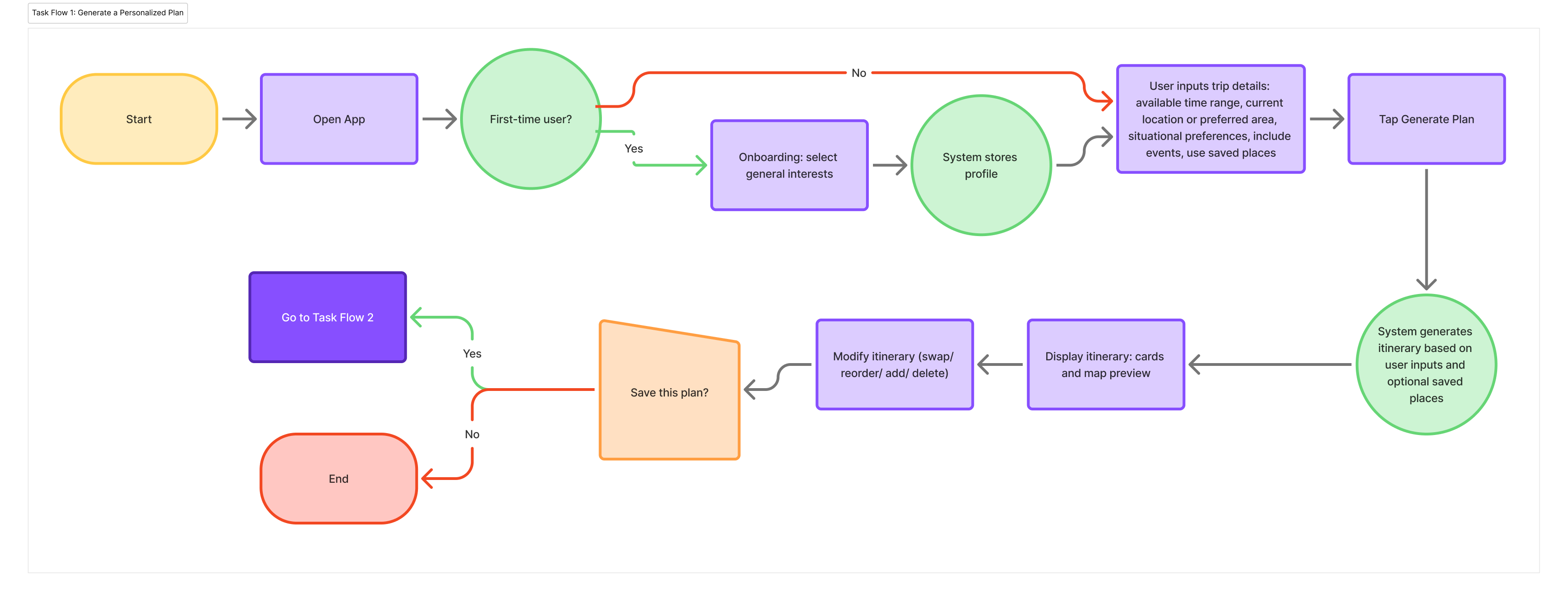

Before moving into sketches, I defined the core actions the prototype needed to support: generate a personalized plan, edit the AI-generated itinerary, and save places or plans for later.
Start a new plan, resume saved plans, or access saved places.
Enter date, time, location, interests, saved spots, and local events.
Review the AI-generated plan, understand each stop, and edit the itinerary.
Save and organize individual spots separately from full plans.
Return to active or completed itineraries later.
Key Screens
I organized the prototype around five main screen categories.
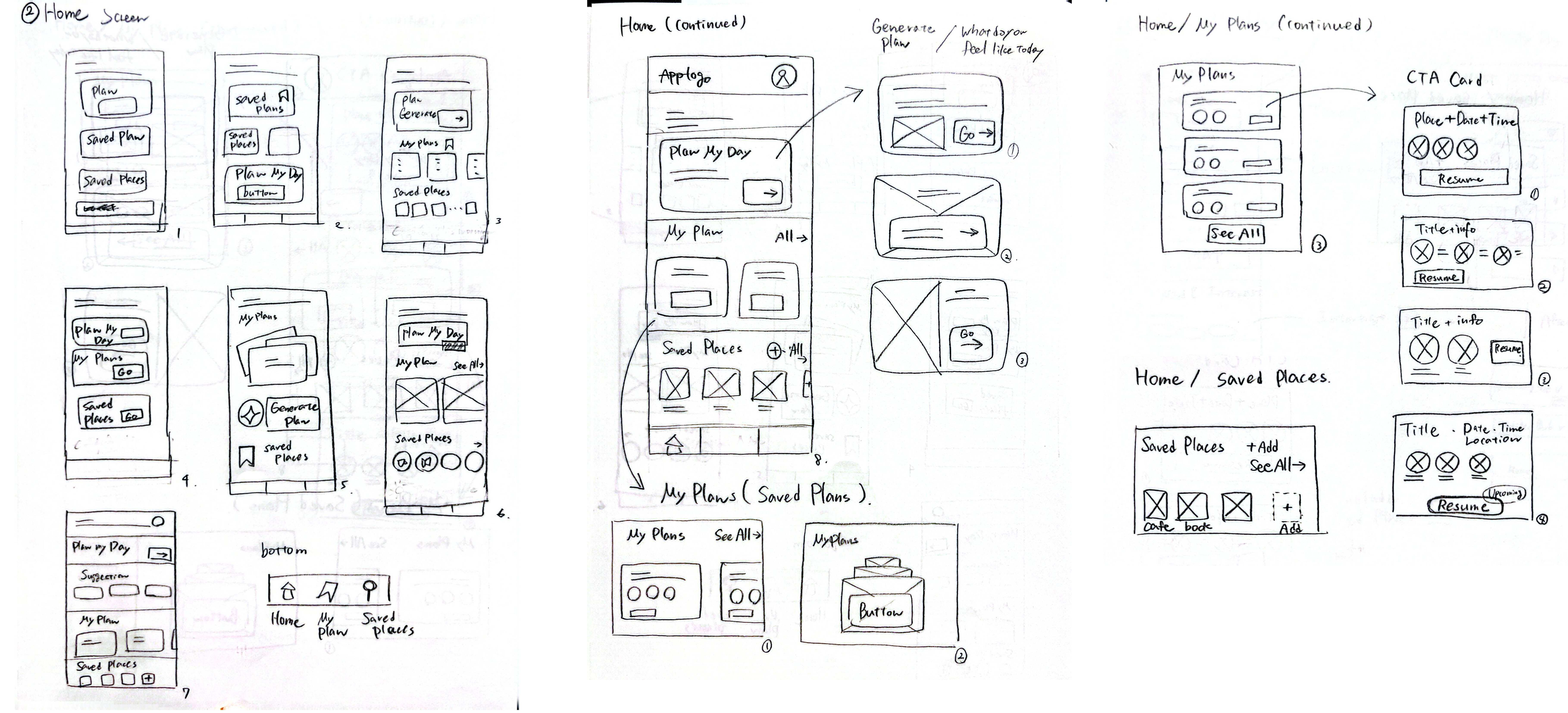
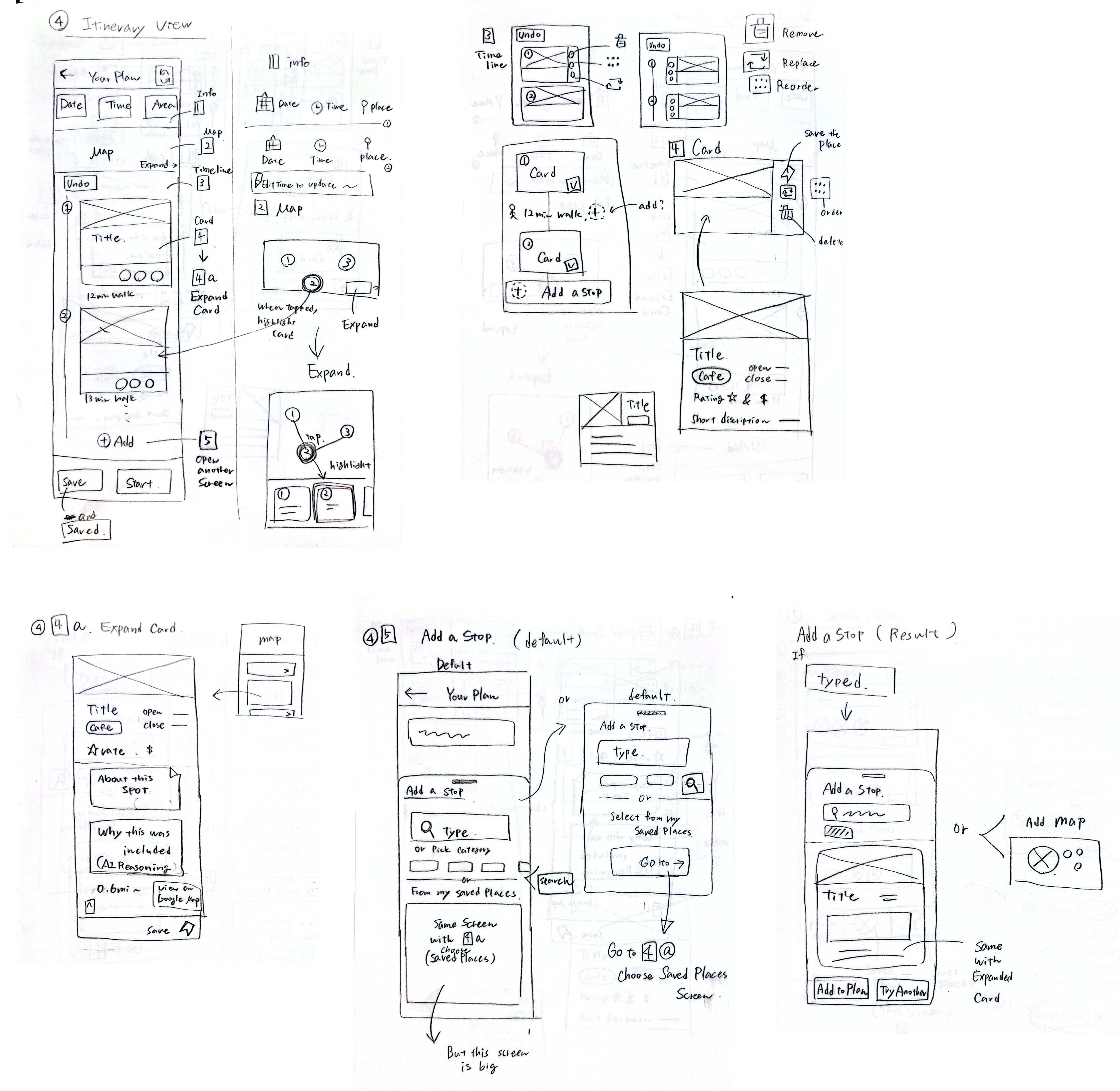
Paper Sketches
I started with paper sketches to quickly explore the structure of each main screen before moving into detailed wireframes. This helped me test layout ideas, navigation patterns, and the relationship between the main planning screens early in the process.

Paper Wireframes
Brand Direction
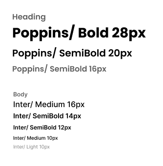
For typography, I used Poppins for headings and Inter for the main interface text. Poppins adds a friendly and energetic tone to the brand, while Inter keeps the app readable and easy to scan.
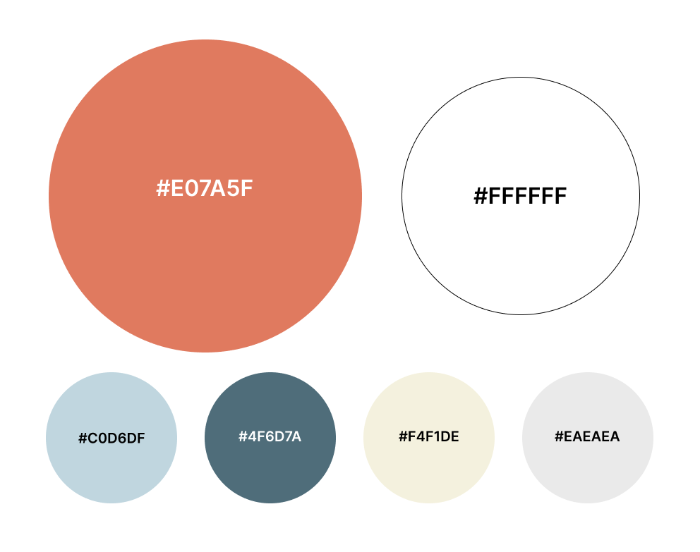
I used white as the primary interface color and coral as the main brand accent. White keeps the app clean and easy to scan. Coral adds warmth, excitement, and a sense of movement.
High-Fidelity Prototype
View Figma Prototype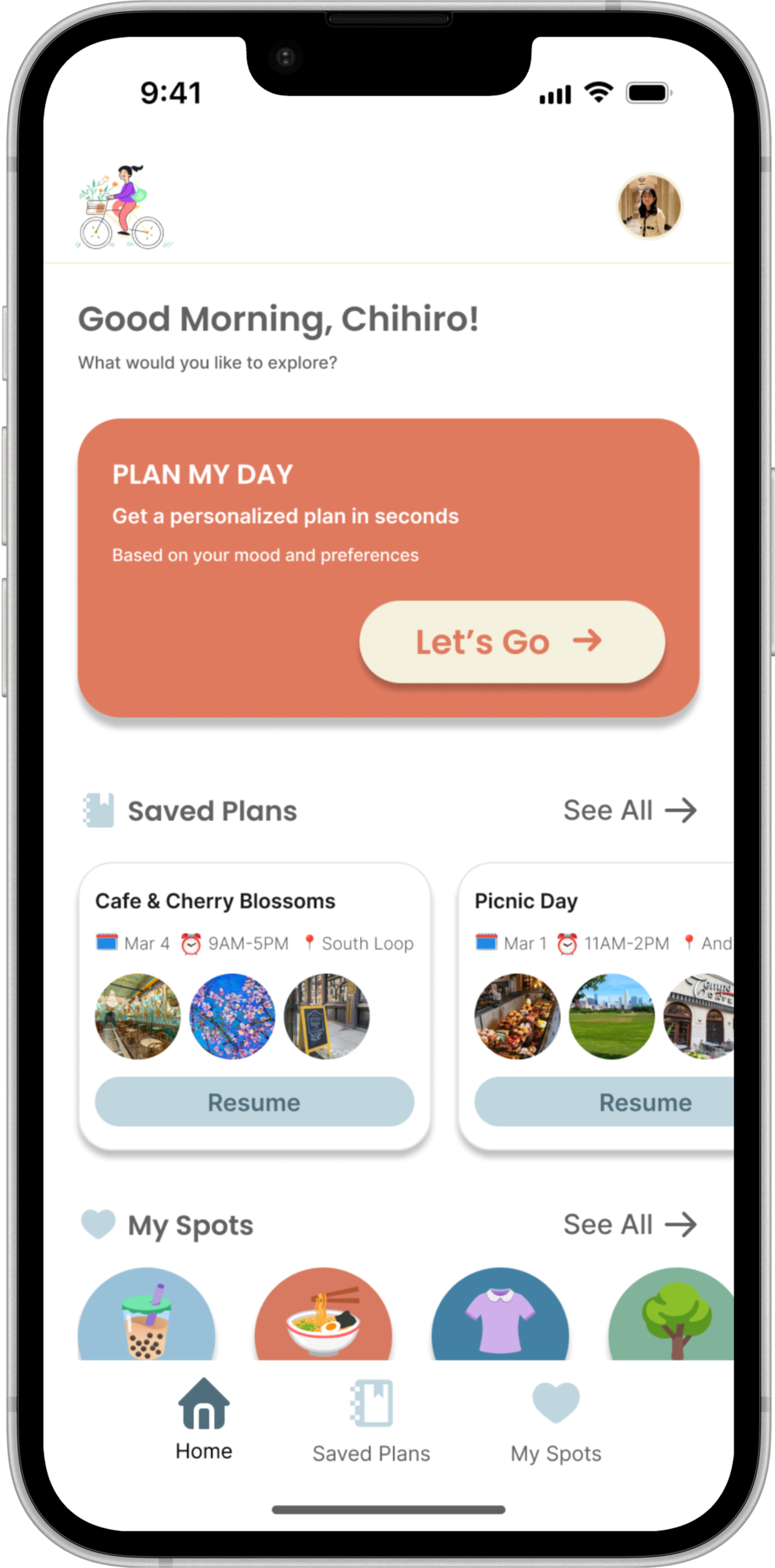
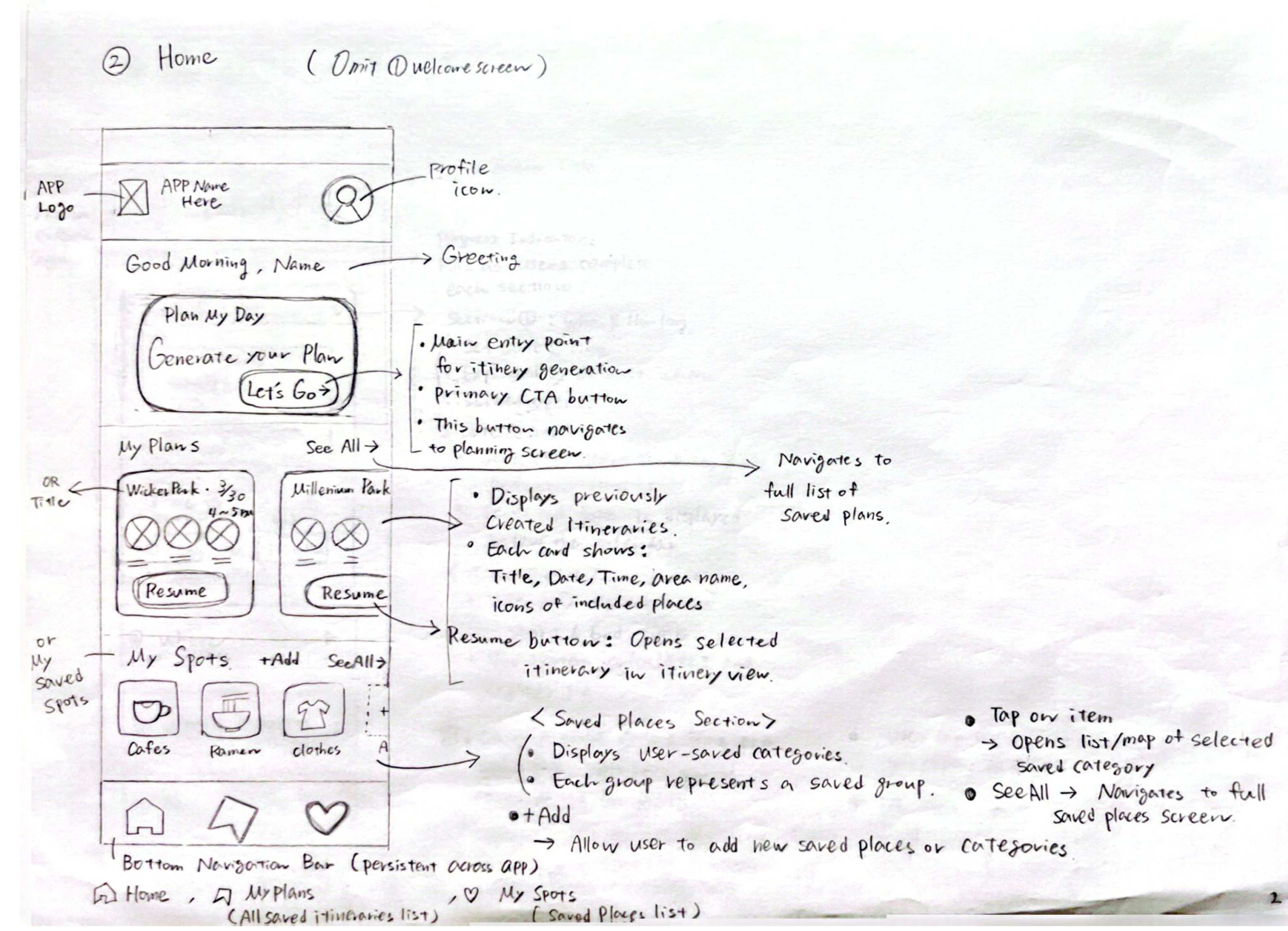
The Home screen works as a simple dashboard for planning and returning to saved content. I placed the “Plan My Day” card as the primary call to action so users can start a new AI-generated itinerary immediately.
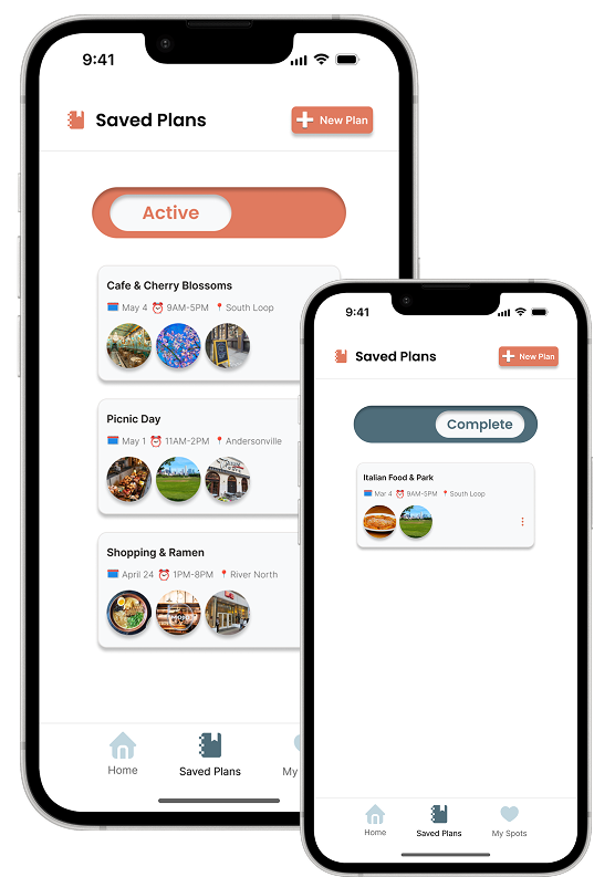
Users can horizontally browse previously saved plans and tap “Resume” to continue a selected itinerary.
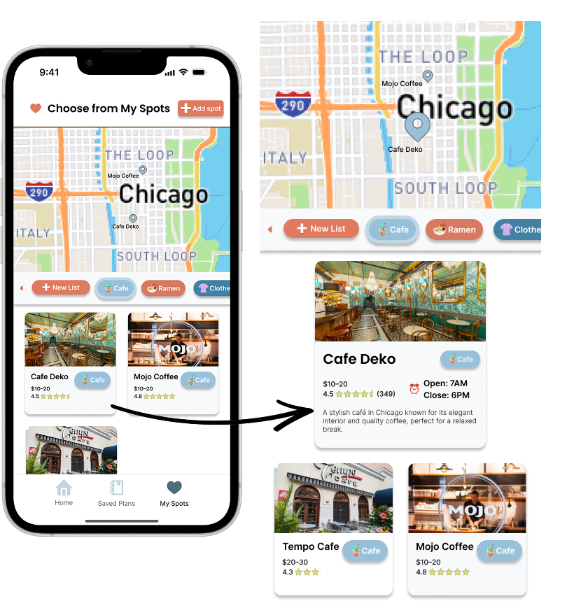
The My Spots section gives quick access to saved place categories, so users can reopen saved cafes, restaurants, shops, or parks and reuse them when planning a new day.
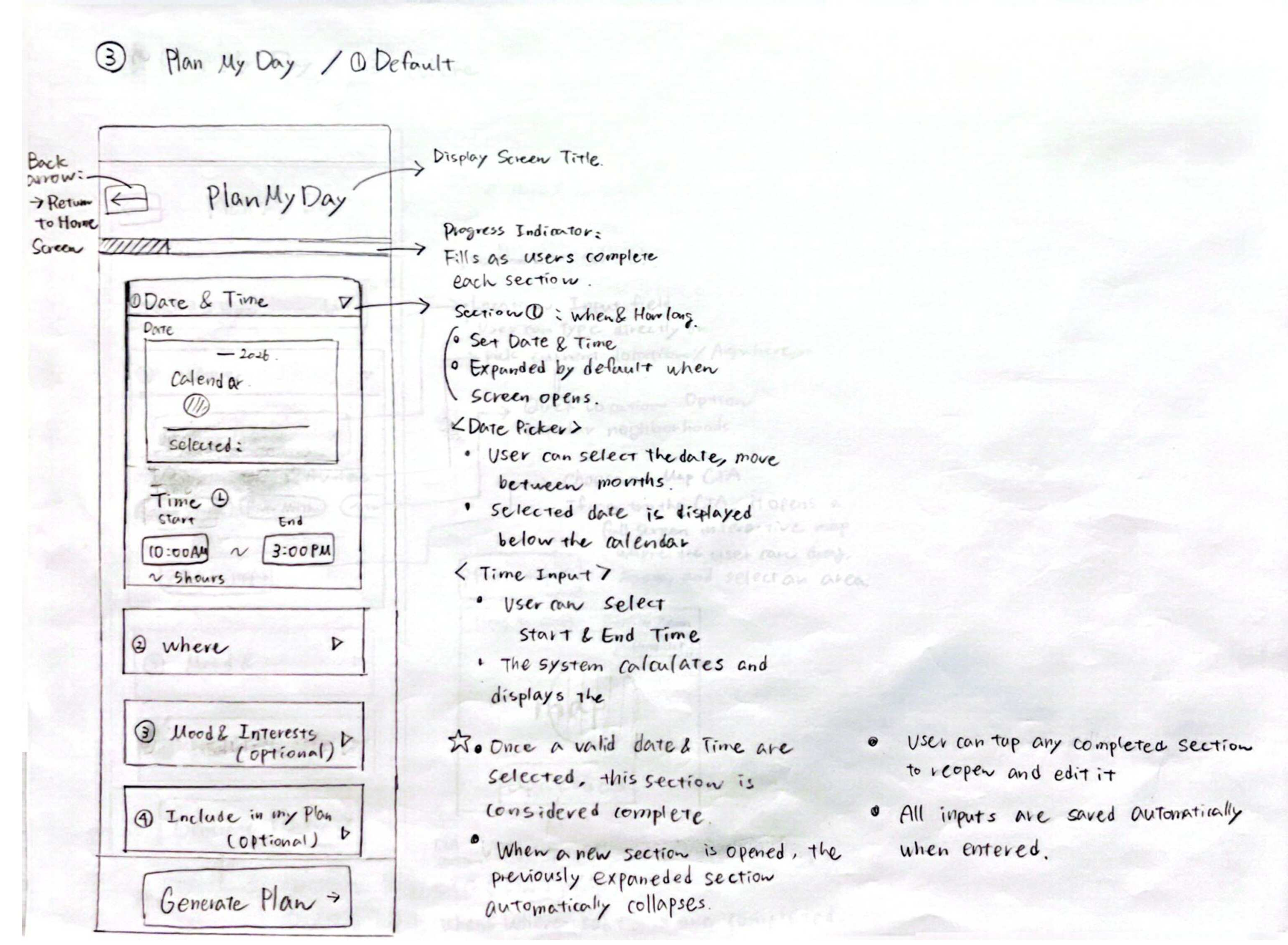
The Plan My Day screen breaks itinerary generation into clear input sections, including date, time, location, interests, and optional saved places or events.
Users select their available date and time window first, allowing the AI to generate a plan that fits their actual schedule.
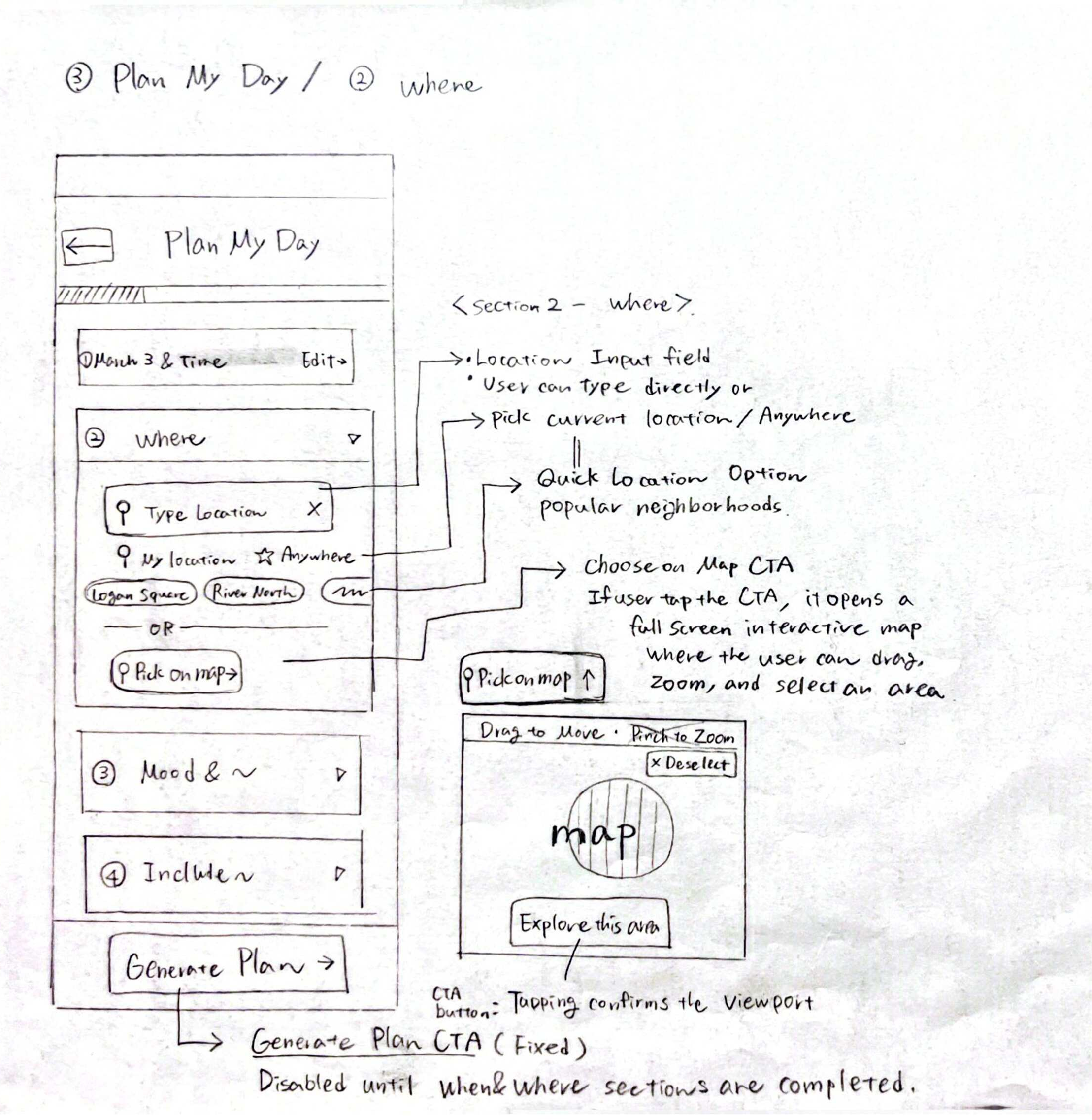
Users can search for a location, choose quick options like “Near Me” or “Anywhere,” select a neighborhood, or pick an area on the map.
Users can select an area directly on the map, giving them a more visual and flexible way to define where they want to explore.
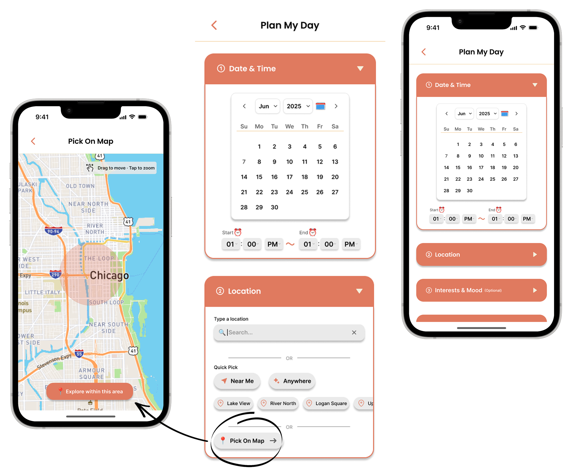
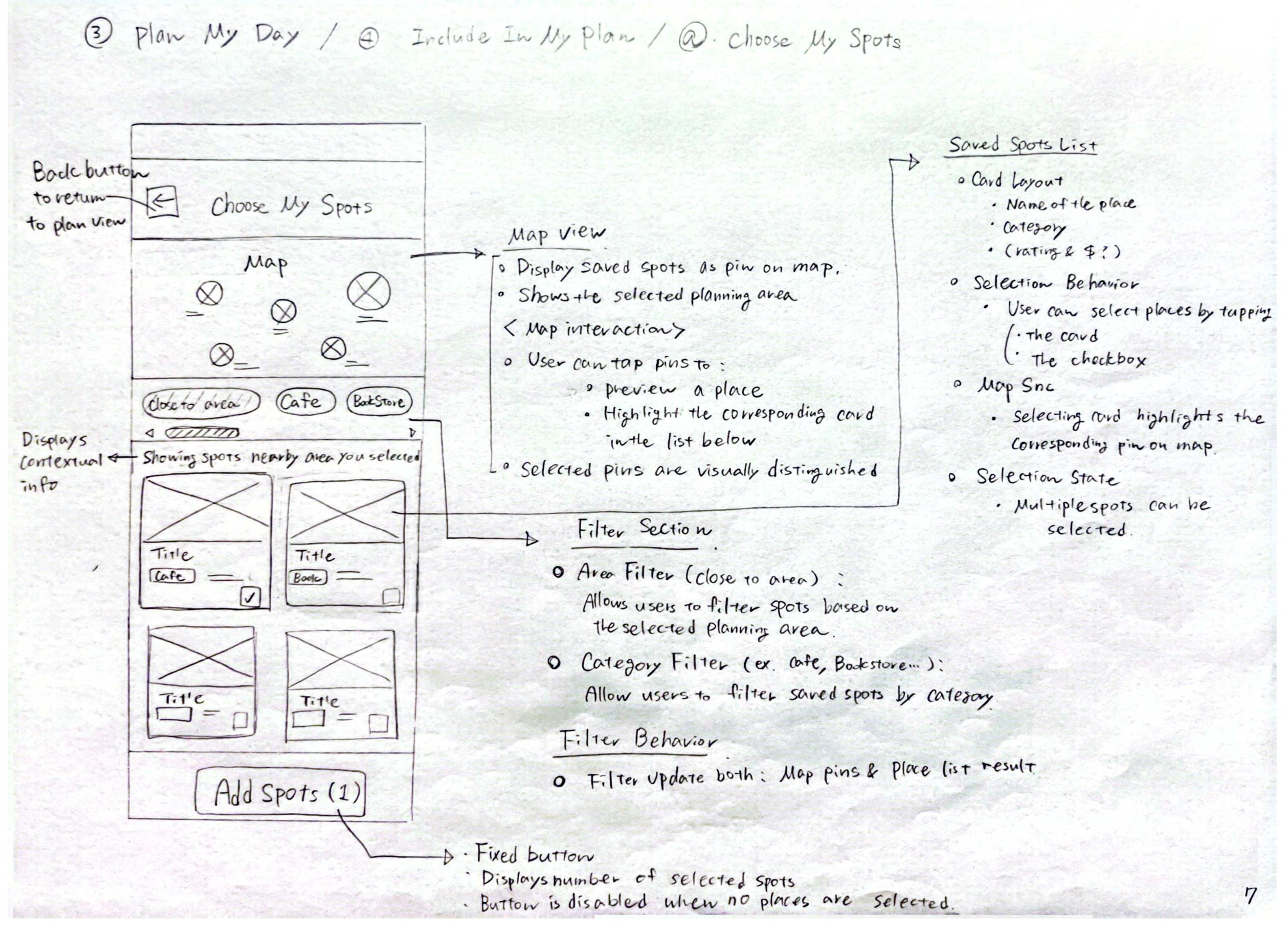
Saved spots are shown as both map pins and visual cards.
Users can filter by area or category, select multiple saved spots, and add them to the plan.
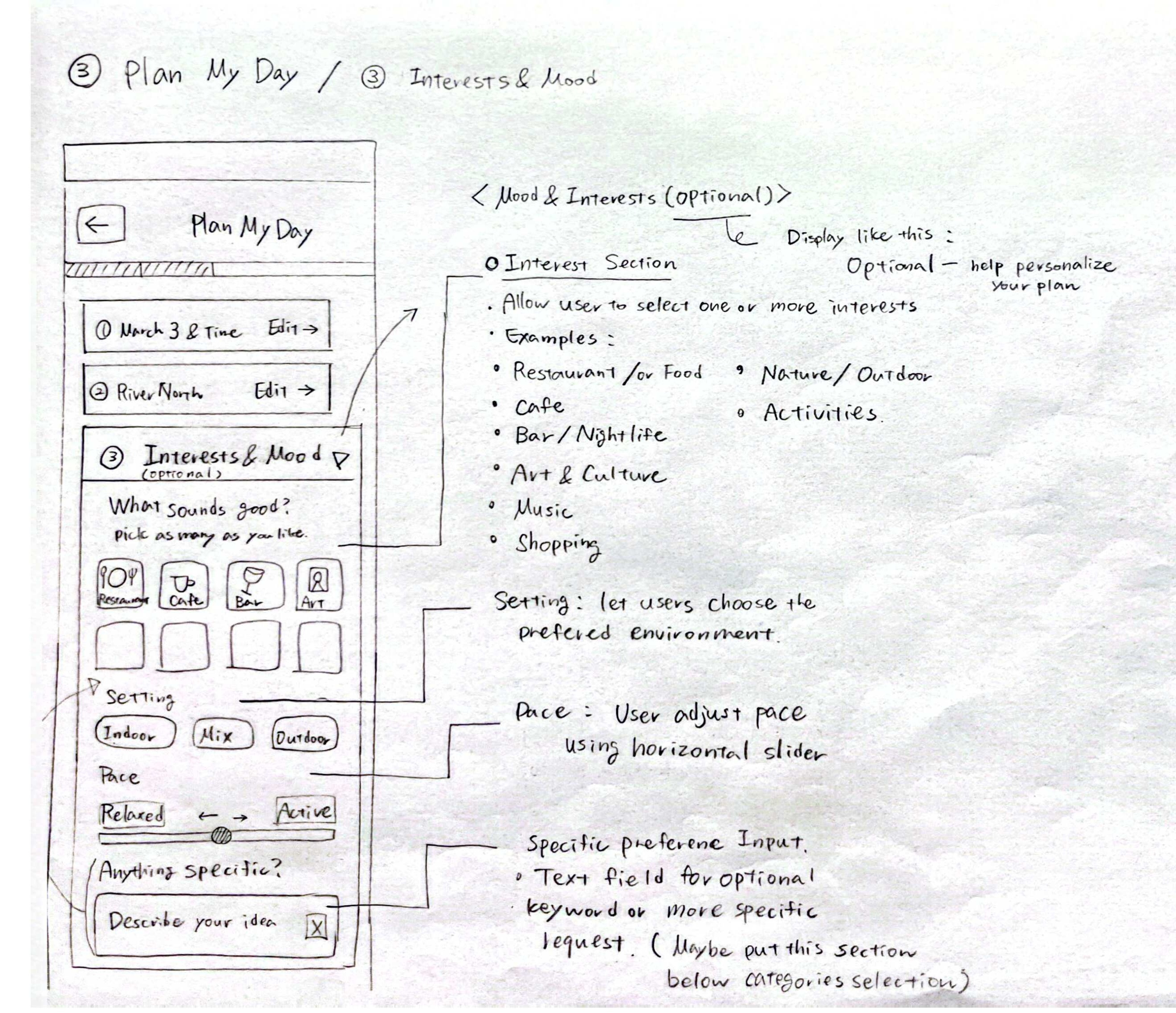
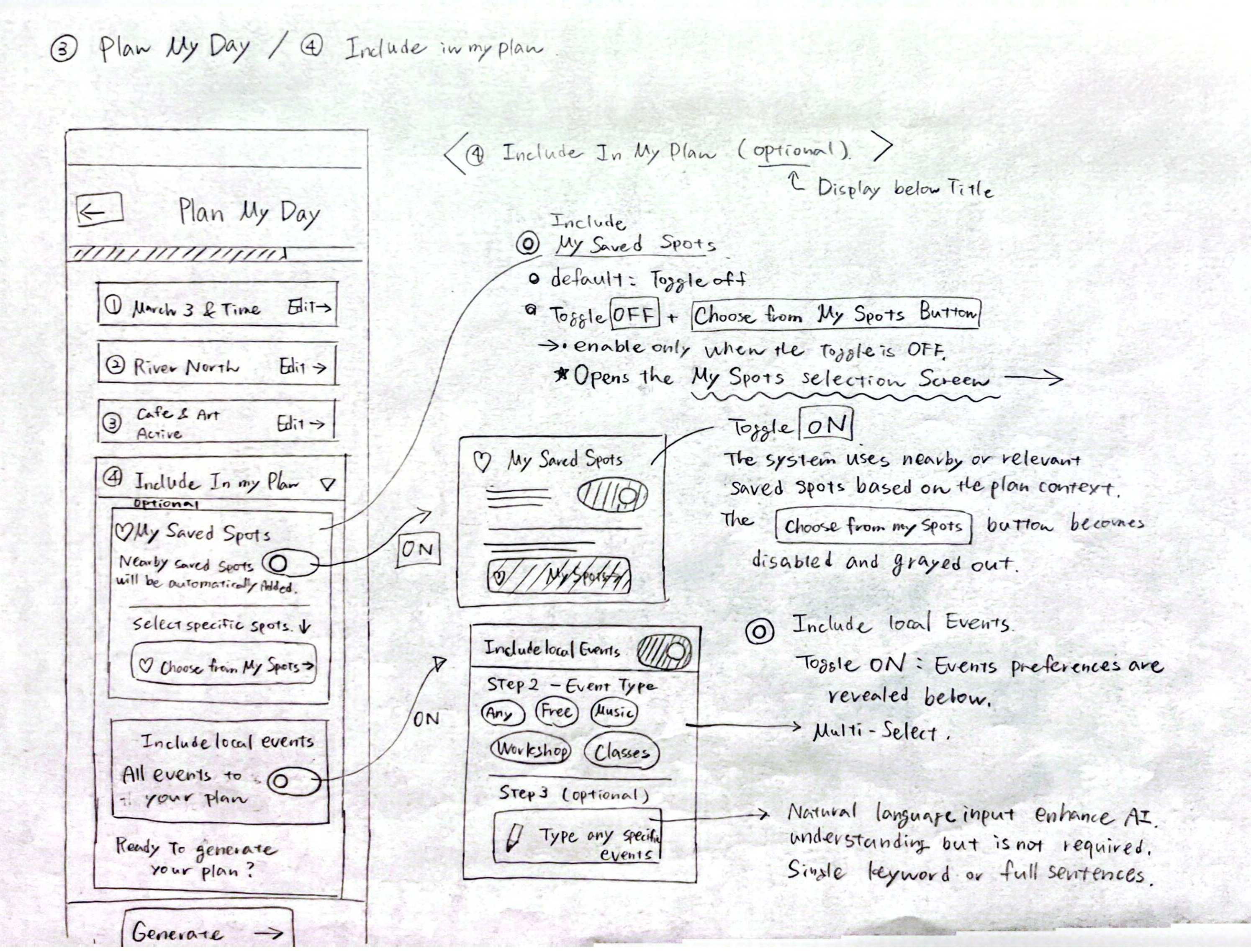
When users turn on Events, they can choose event types such as free events, music, classes, or workshops.
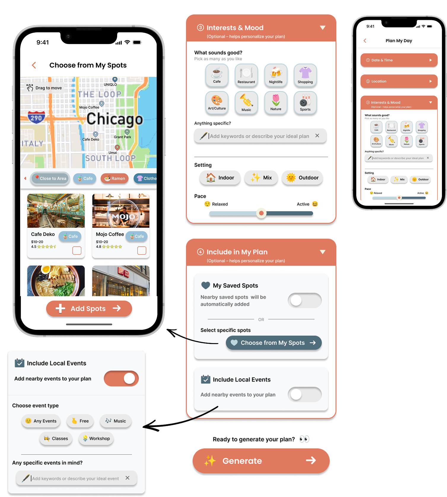
Users can choose one or more activity types using tappable chips.
An optional text field lets users add specific preferences.
Setting and pace controls help users shape the overall feel of the outing, from indoor or outdoor preferences to a relaxed or active plan.
Users can let the app automatically consider nearby saved spots or manually choose specific spots.
Users can also turn on local events so the app can include nearby events in the itinerary.
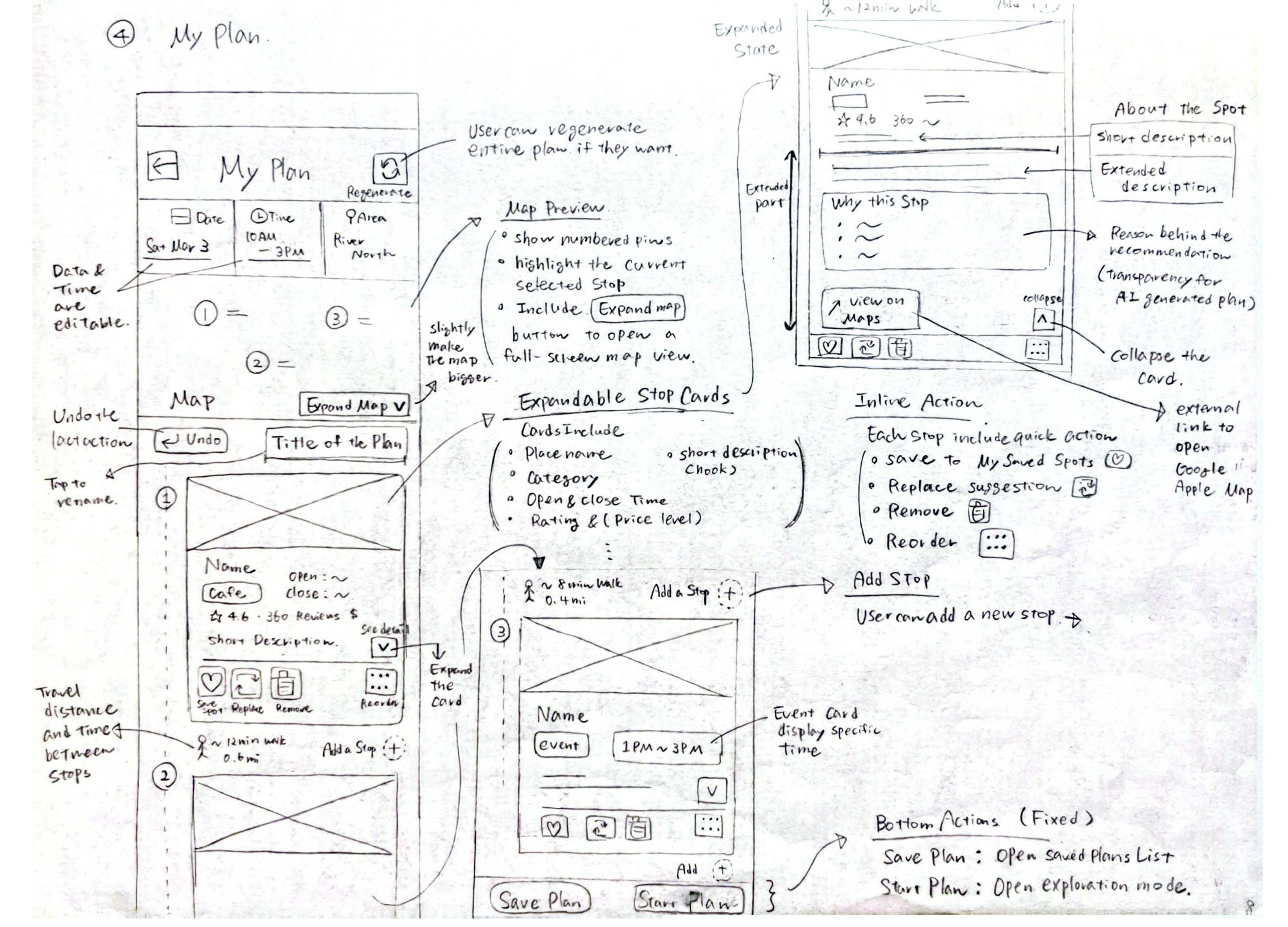
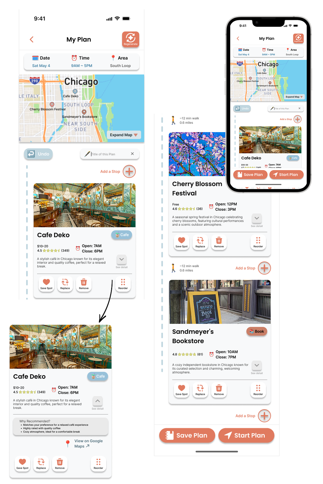
The generated itinerary is shown with a map preview, date, time, area, and visual stop cards.
Travel time and distance are shown between stops, helping users judge whether the route feels realistic.
Inline actions let users save a spot, replace a recommendation, remove a stop, reorder the itinerary, or add a new stop.
Users can expand a stop card to view more details, including a “Why Recommended” section. This makes the AI recommendation more transparent.
The bottom actions let users save the itinerary for later or start the plan when they are ready.
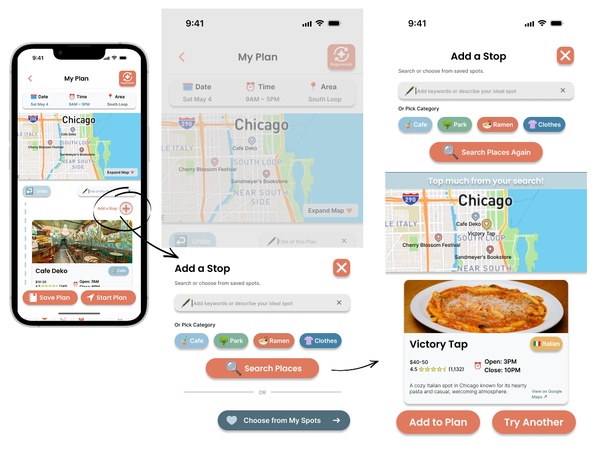
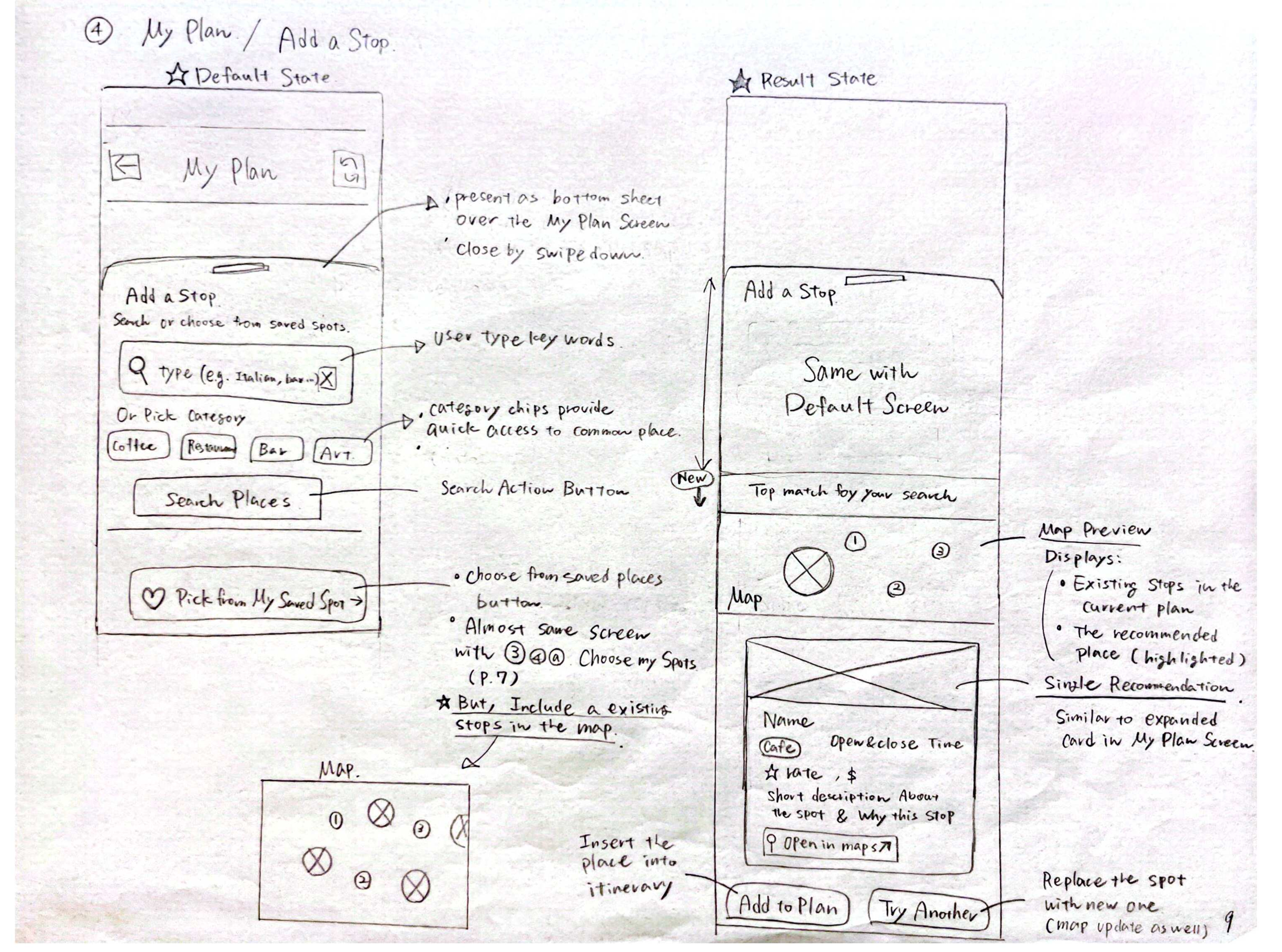
Users can type a specific keyword or choose quick category chips. This supports both specific searches and quick browsing.
The result state shows the top match. Users can add the suggested place to the itinerary or try another option.
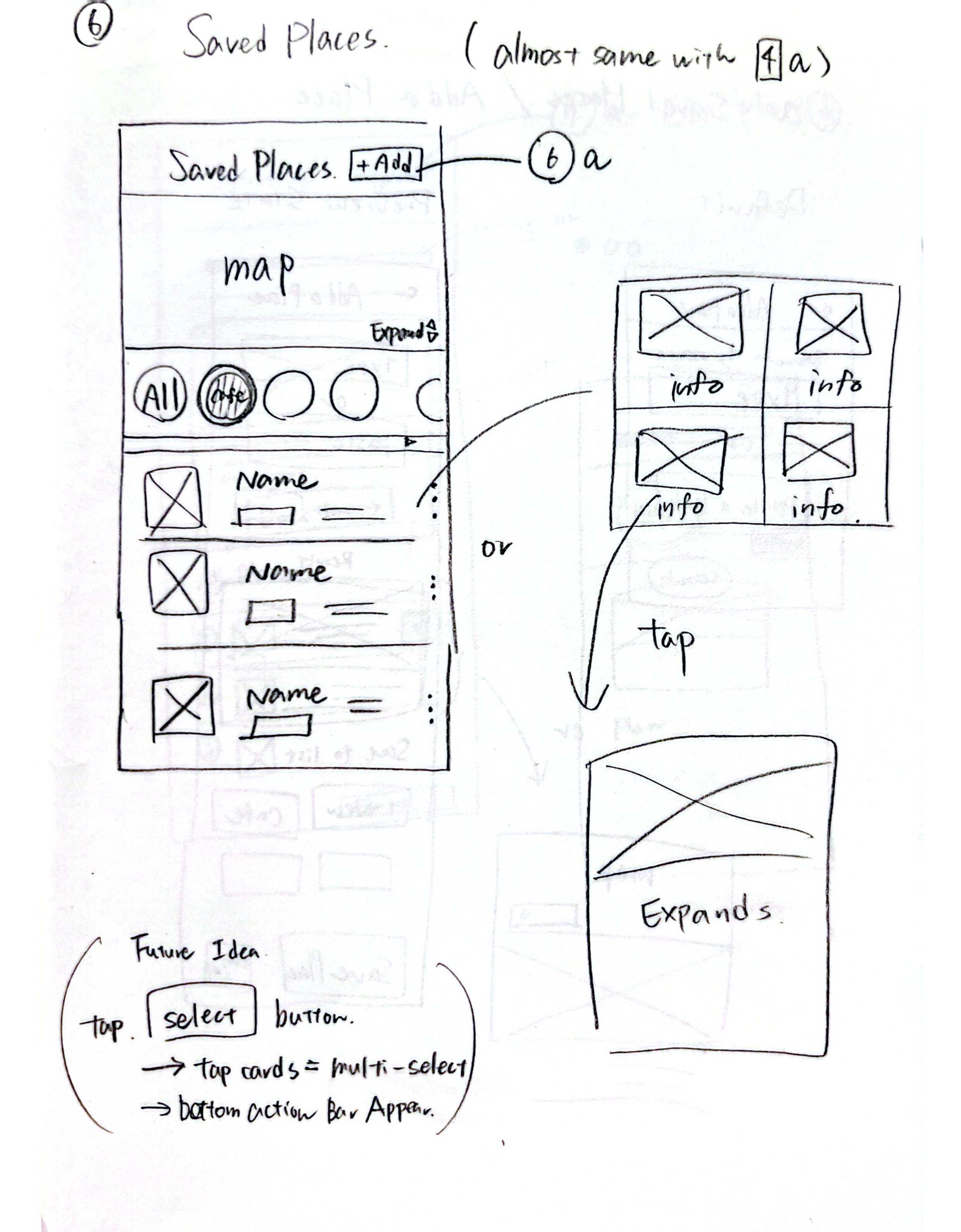
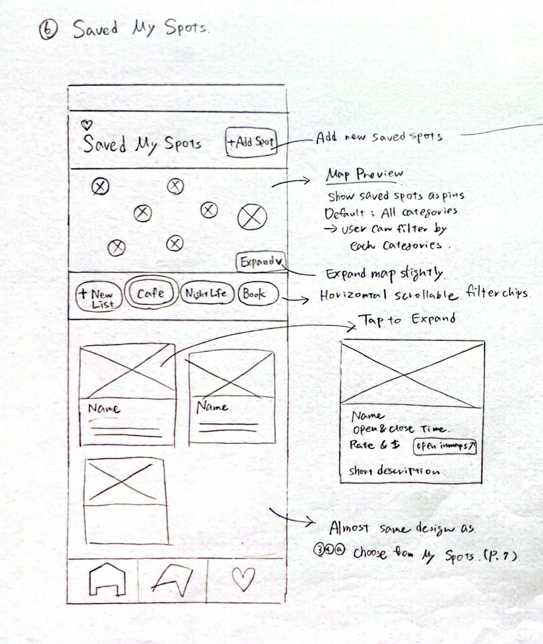
My Spots lets users save individual places. This gives users a personal collection of spots they may want to visit later.
Category chips help users quickly filter saved places by type.
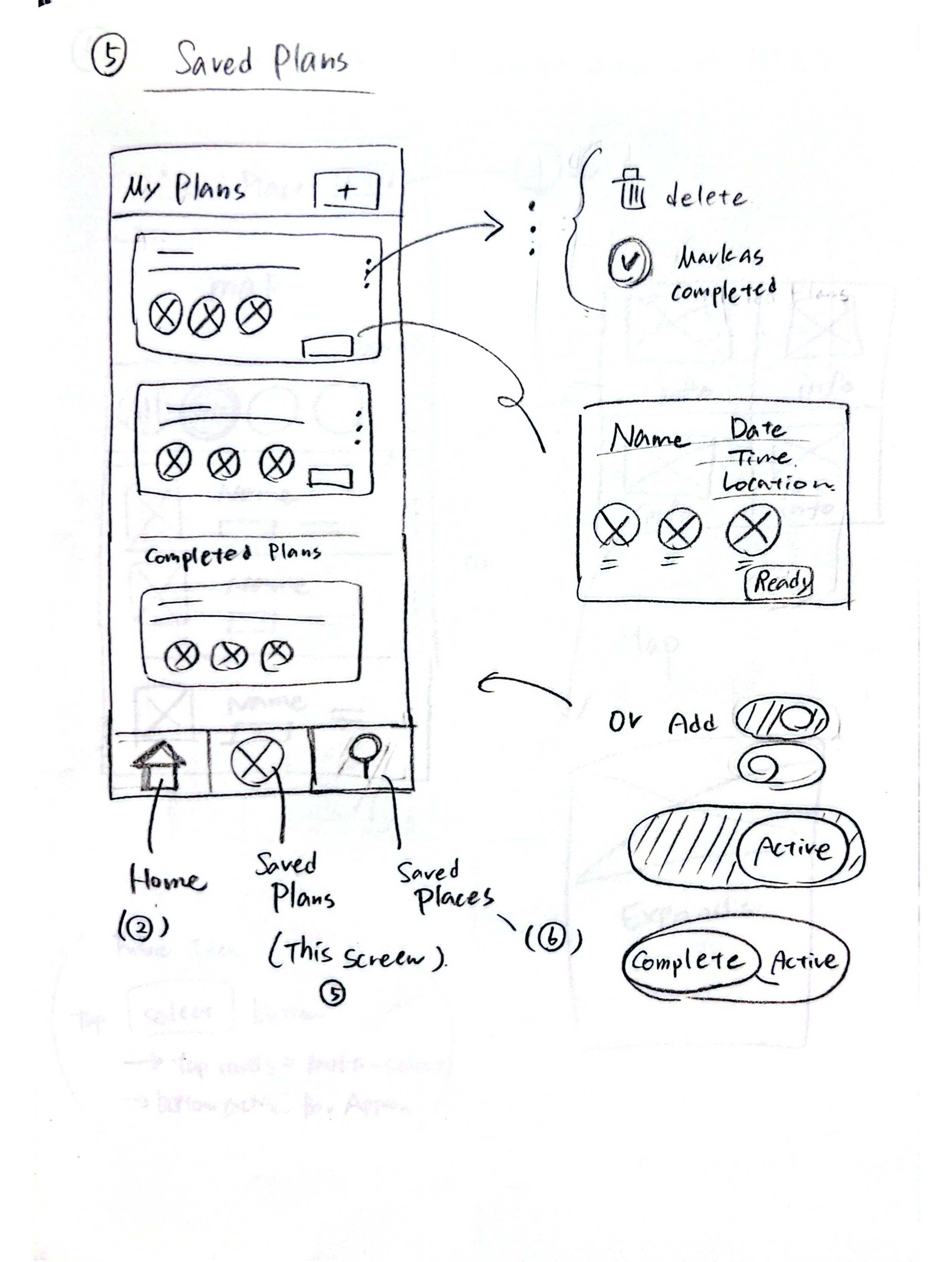
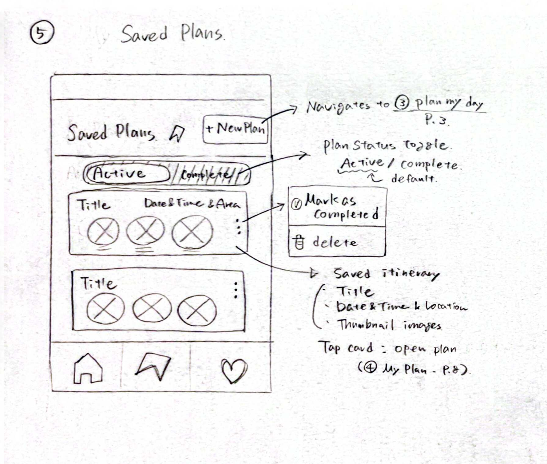
Saved Plans lets users return to itineraries they created earlier.
Plans are organized into active and completed states.

The testing process included two rounds. Round 1 was a preliminary feedback session with three participants. Based on Round 1 feedback, I refined the prototype before formal testing. I slightly adjusted the color palette and typography, created additional screens that reflected different user selections, and added more Figma interactions so the prototype could better match user expectations during testing.
After refinements, I moved into Round 2, a task-based usability test with two participants. In this round, I recorded task completion, time on task, errors, satisfaction, verbal feedback, and SUS scores.
Strong perceived usability, treated as an early positive indicator because only two participants completed the formal SUS evaluation.
Generate a personalized plan
Review the generated itinerary
Edit the itinerary
Find why a place was recommended
Both participants were able to move through the setup flow and reach the generated itinerary. This showed that the basic concept of selecting preferences and receiving an AI-generated plan was clear.
Users understood the map, stop cards, ratings, hours, and recommendation explanations.
Both participants successfully found and understood the “Why Recommended” section. This confirmed that explaining the AI’s reasoning helped users understand why a place was included.
Both participants had difficulty with the calendar, month selection, or time controls. This showed that the input interaction needed clearer visual cues.
One participant noticed that the generated itinerary did not fully match their selected location and food preference.
Users expected visible controls such as remove, reorder, undo, and add stop to work. For future testing, I would either make these actions functional or hide unsupported controls.
Reflection & Takeaways
To keep the prototype focused, I had to cut several features that were originally considered. I removed Explore Mode because the project was about planning and editing, not turn-by-turn navigation. Instead, users could open Google Maps from each stop card.
I also chose not to build a full event browsing screen. Events were included as an optional toggle in the planning flow, which kept the experience focused on generating a complete itinerary rather than becoming another discovery app.
Because this was a Figma prototype, the AI-generated plans were simulated through pre-built scenarios. This helped me test the interface concept, but it also showed that visible editing controls, such as Remove, Reorder, and Undo, needed to be either fully functional or removed from the test version.
The biggest takeaway was that AI interface design is not only about automation. Users need to understand why recommendations appear, judge whether the plan is realistic, and feel that they can change the result.
Features like Why Recommended, travel time, and inline editing became central because they helped balance AI-generated convenience with user trust and control.
This project reinforced the value of research before visual design. Background research, interviews, competitive analysis, and user needs analysis helped me decide what to include, what to cut, and how each feature should support the planning process.
If I continued this project, I would improve preference matching, make all editing controls fully functional, connect the prototype to real location and event data, and test with a larger group of users.