ChicaGo is the first version of my city exploration concept, turning user preferences into personalized itineraries and later evolving into City Explorer.
Planning a local day out in Chicago takes more effort than it should. People want to discover authentic neighborhood spots, but they often have to search across multiple apps and still end up with generic or tourist-focused recommendations.
I collaborated with one partner during the research phase. After that, we each developed our own design direction, including flows, wireframes, and prototypes.
Mental Model: Eat This Much
I studied Eat This Much to understand how automated planning systems guide users from preferences to personalized plans. Although it focuses on meals, its mental model helped shape my city exploration concept: users set goals, the system generates a plan, and users stay in control through review and customization.
Define goals and preferences.
Generate and adjust the plan.
Follow guided steps.
Rate and refine future results.
Stakeholders & Product Goals
I mapped the key stakeholders and defined the product goals that would guide the app’s direction, balancing user needs, business value, and the local Chicago ecosystem.
Personas
Survey & Secondary Research
We created a Qualtrics survey to explore user behaviors and identify patterns around local discovery. Since we were unable to recruit follow-up interview participants, we supplemented the data by reviewing articles and online communities like Reddit.
100% relied on word of mouth, followed by social media at 86% and Google at 57%.
Food and Drink ranked highest at 100%, followed by Art and Community Events at 86%.
Tourist-focused results, fake reviews, and switching between apps were common frustrations.
71% valued local recommendations and event timing when deciding where to go.
43% explored weekly, while 29% explored several times a week.
Users explored to try new things, support local businesses, and spend time with others.
Affinity Mapping
We used affinity mapping to organize patterns from the survey and secondary research. Similar ideas were grouped together, helping us identify three main themes.
People like wandering and finding unexpected places, but too many choices can make it hard to know where to go next.
People want places that feel local and real, not touristy. They need signs that a spot is actually trusted by locals.
People use apps, but they also trust personal recommendations. When sources conflict, they need help making a confident choice.
Use Case Definition
The themes helped define two core use cases: exploring freely with guidance and managing saved plans for future outings.
User Goal: Explore freely while getting helpful nearby options.
User Goal: Save, manage, and resume exploration plans easily.
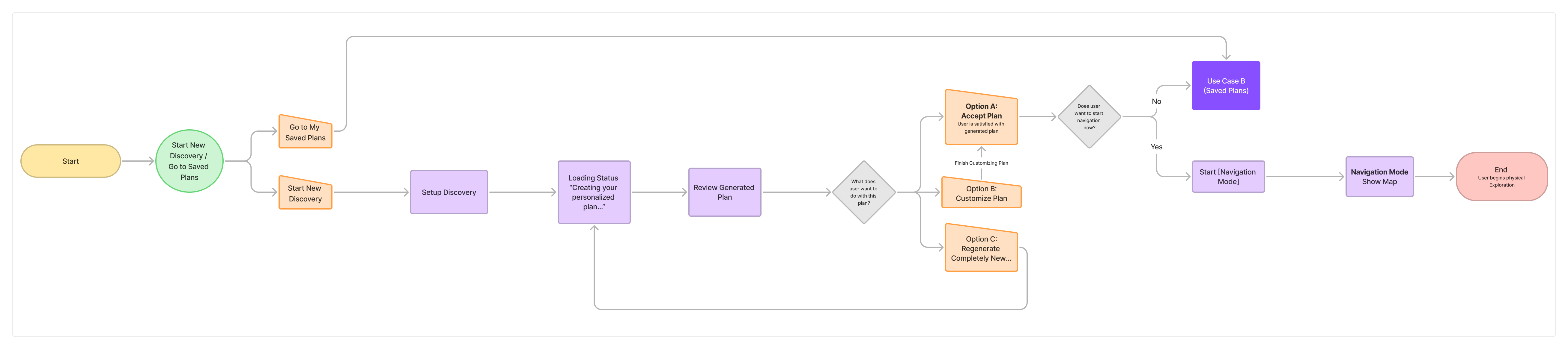
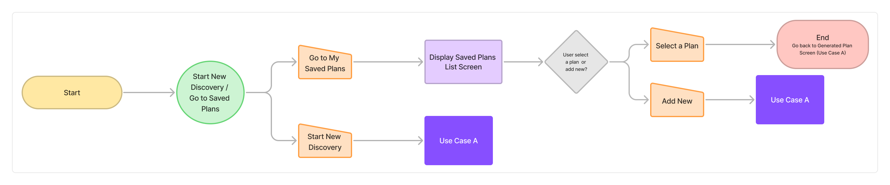
Task Flows
I translated the use cases into task flows to clarify the main user steps, decision points, and system responses.
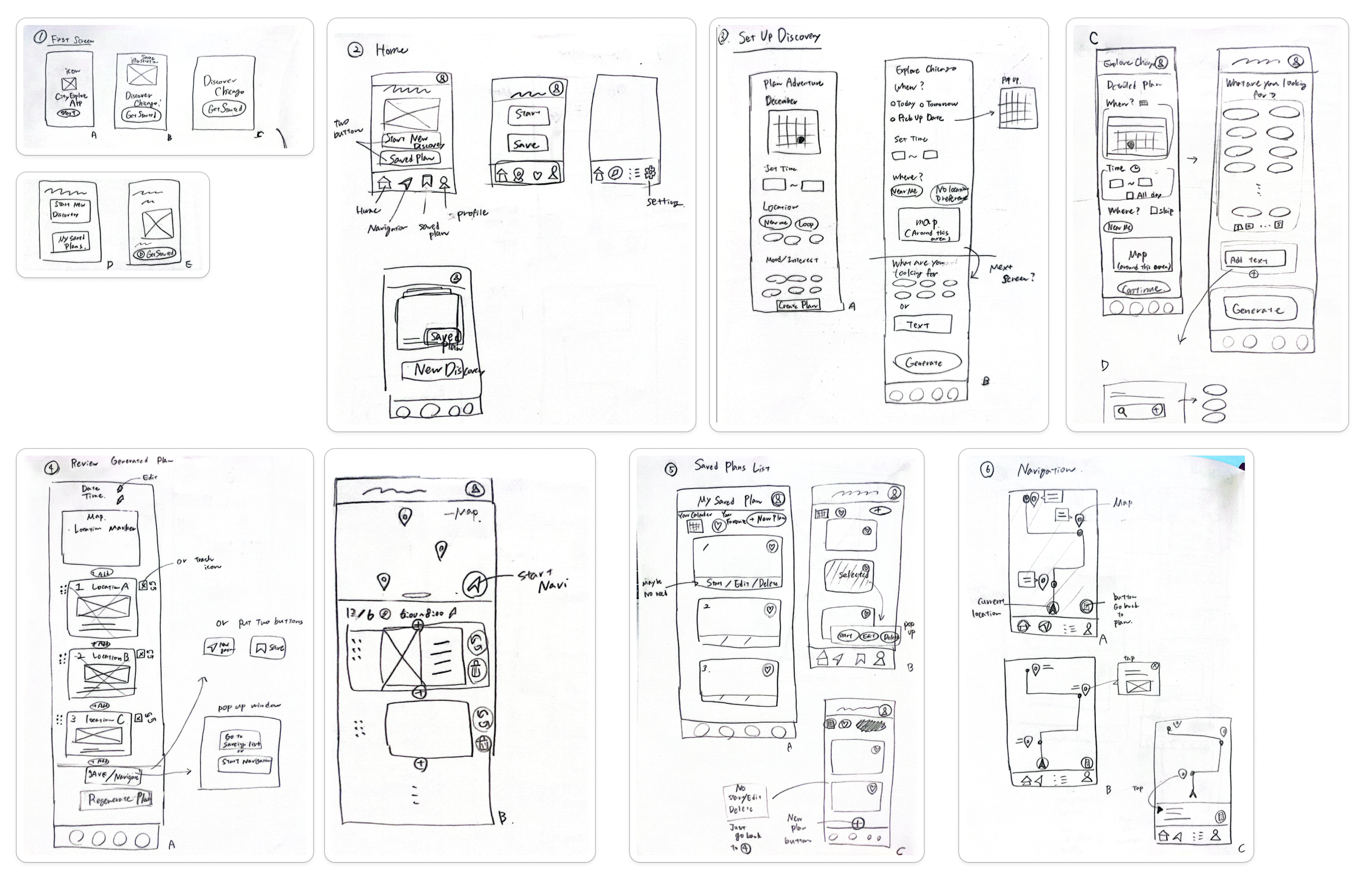
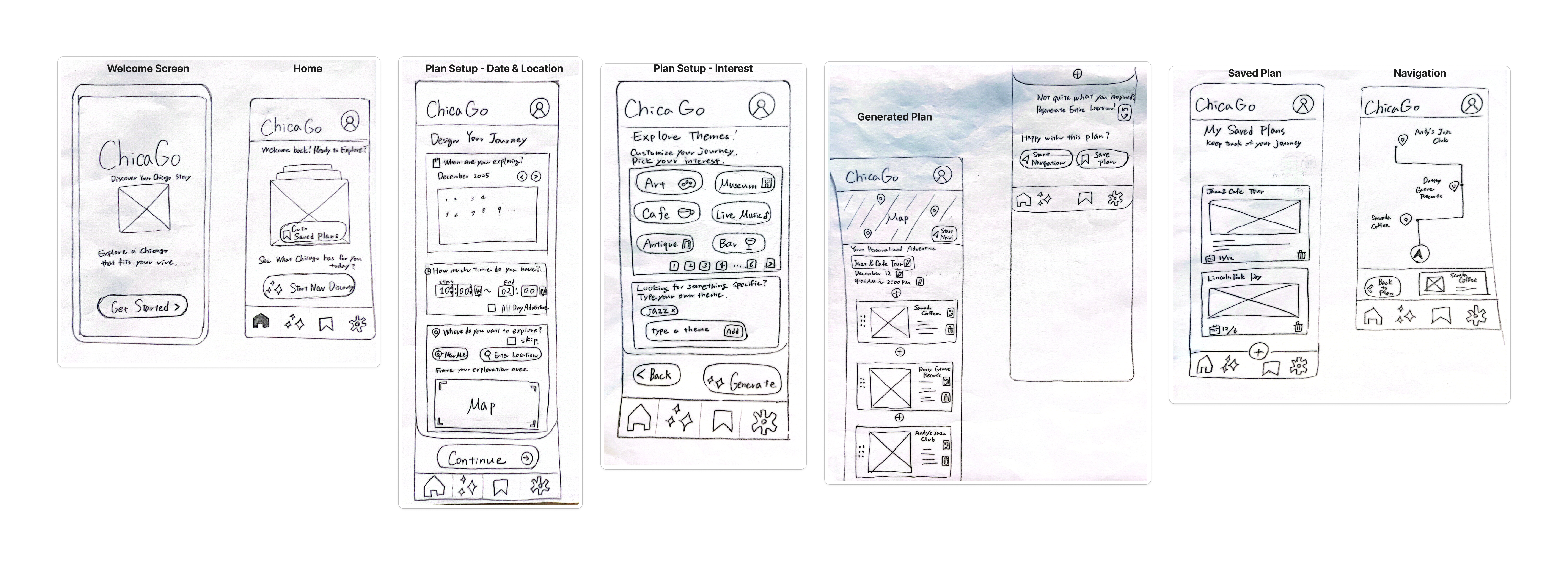
Paper Sketches
I began exploring screen layouts through rough sketches to quickly test structure and navigation patterns before committing to wireframes.
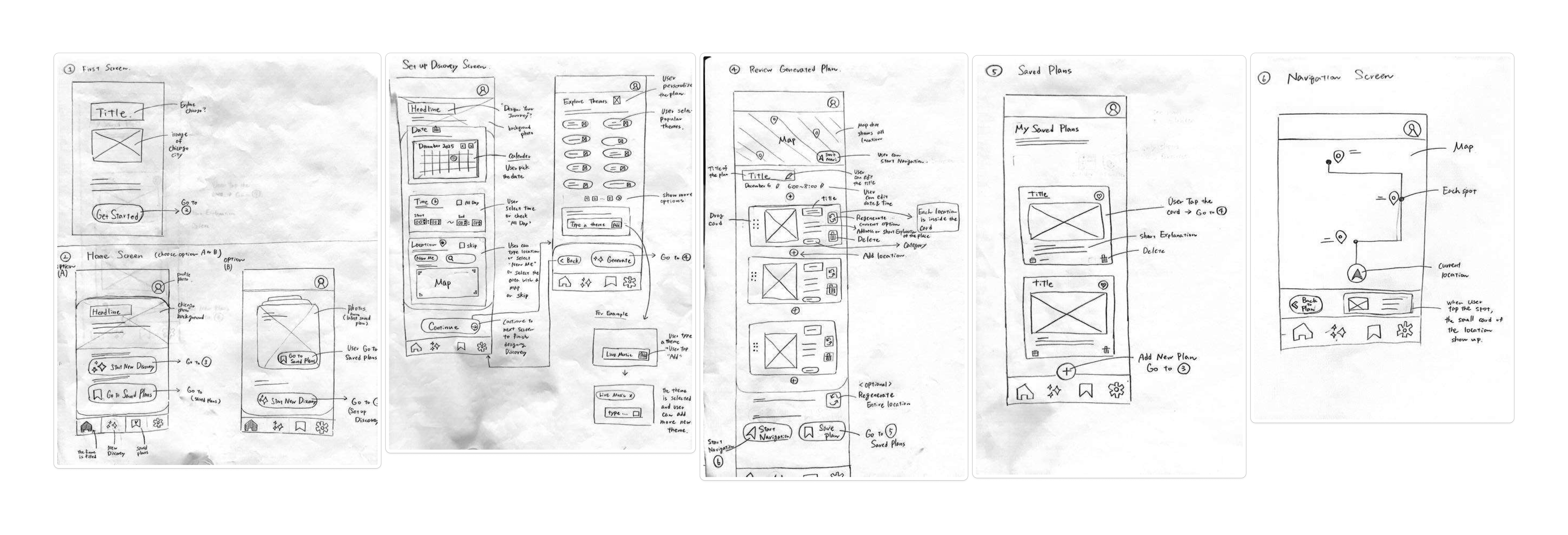
Wireframes
Sketches were refined into wireframes, establishing information hierarchy and layout.
Low-Fidelity Prototype
I connected the wireframes into a low-fidelity prototype to test overall navigation and interaction flow.
High-Fidelity Prototype
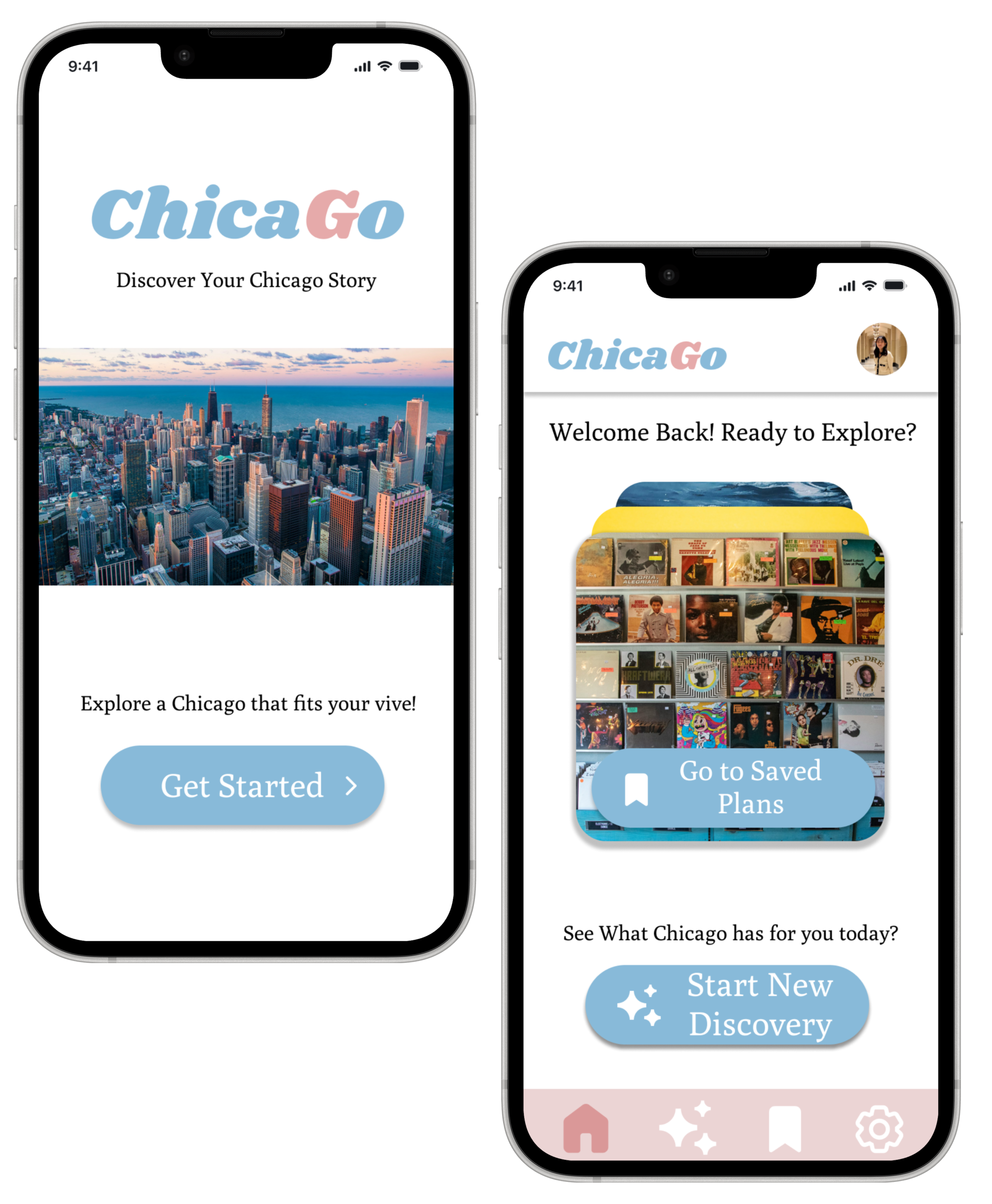
View Figma PrototypeThe welcome screen introduces ChicaGo as a local exploration tool and creates a clear starting point for first-time users.
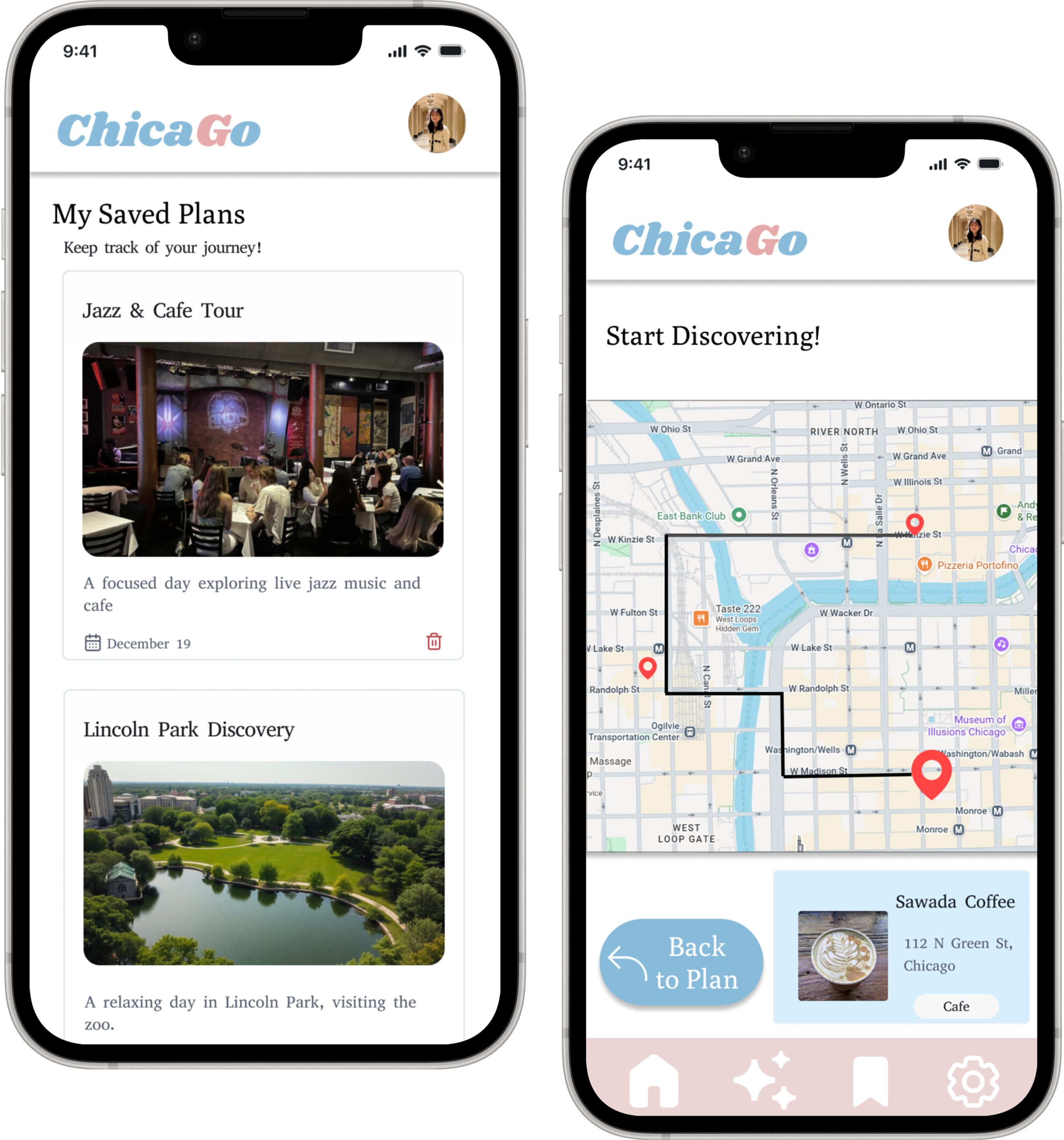
The home screen gives users two main paths: start a new discovery or return to saved plans. This keeps the entry point simple and supports both new and returning users.
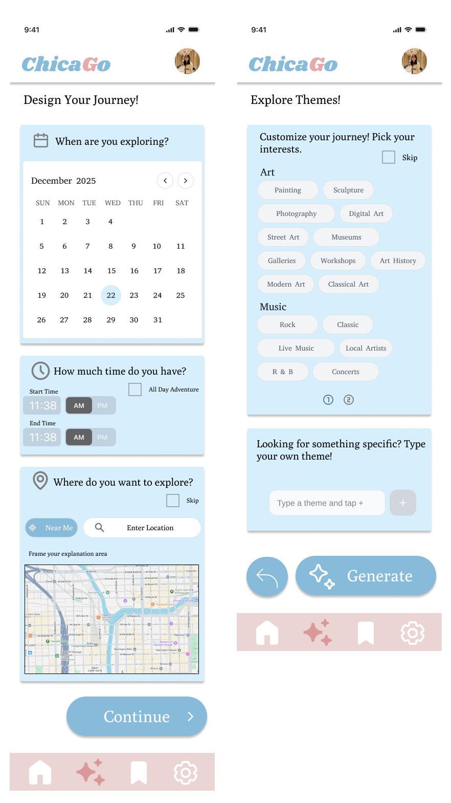
This screen helps users set the foundation for their outing by choosing a date, time, and exploration area.
This screen lets users add specific interests, helping the system generate a plan that matches their preferences.
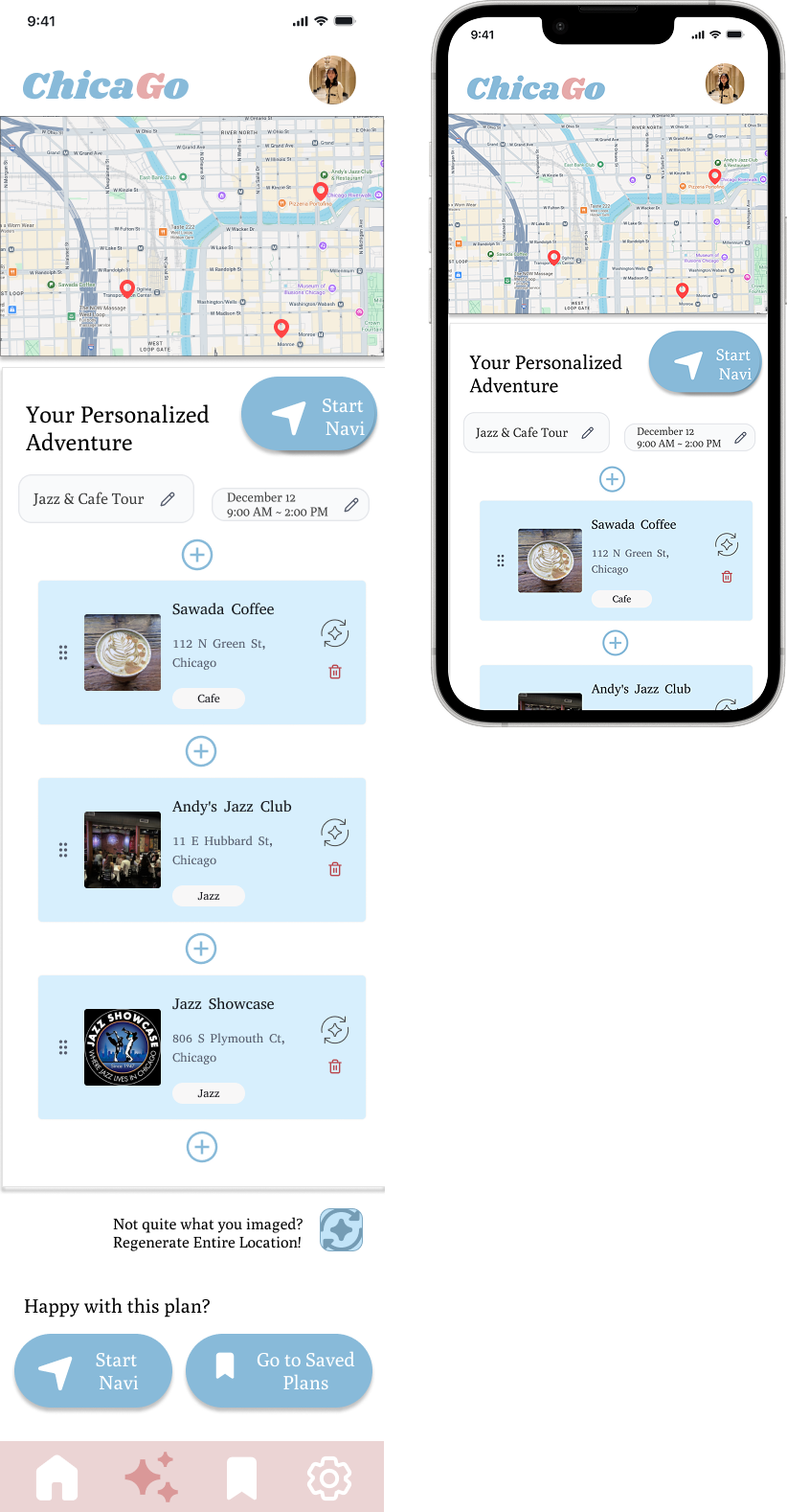
After users set their date, time, location, and interests, the app generates a personalized itinerary with a map preview and recommended stops.
Users can review the plan, adjust individual places, regenerate the route, start navigation, or save the plan for later.
Reflection & Takeaways
City exploration apps either handle discovery or navigation, not both. I borrowed structure from other domains, like Eat This Much, to model how a preference-based generation cycle could work.
The concept had many possible directions. Cutting onboarding and advanced saved-plan management made the core flow clearer and kept the prototype focused.
We couldn't recruit interview participants, so we supplemented survey findings with secondary research and community quotes to fill the qualitative gap.
Cutting features is a design decision. Removing ideas that didn't serve the core use case made every remaining screen easier to understand and use.
Collaborative research produces stronger insights. Partnering on the research phase pushed both of us to articulate ideas more clearly and challenge assumptions early.
Cross-domain analysis is a real tool. Studying a meal planner gave me a repeatable mental model, setup, generate, review, customize, that translated directly into the city planning flow.